Monthly Archives: April 2011

Exercise: Curves

For this exercise I had to take four photographs using curves to emphasise movement and direction.

Curves 1

I love this image, I did a tight crop looking up inside a structure at the Space Museum. As it was a bright day and it was quite monochrome to start with, I just converted it black and white for more effect.

Curves 2

While this car was static, the streamlined art deco styling creates a sense of movement with the curved bonnet of the car and then re-enforced with the curving lines of the bonnet and the radiator.

Curves 3

For a different take on curves, this image has a curving road to the left  but also the illusion of a further curve to the right. I was inspired to take a less obvious image after looking at the suggested curves in an image within the course book.

Curves 4

The final image of curves was of a spiral staircase taken from the top looking down and following the curving steps down.

Exercise: Diagonals

This exercise required me to take 4 photographs featuring diagonals, either real diagonals such as staircases or diagonals created through camera angle and perspective.


Diagonal 2

For this image, the railway tracks curved off and away into the distance, I created the diagonal effect by positioning myself to the left at an angle and focusing on the right hand tracks for the diagonal.

Diagonal 3

This was taken at a museum and due to the setting and barriers, the only viewpoint I could get was from a side view. I like the rolls of cotton forming the diagonal through the frame and focusing close in cut out the background and creates leading lines for the eye.

Diagonal 4

This is the closest that I came to finding a natural diagonal. A local boat lock forms a diagonal zigzag from a certain perspective. I framed this image carefully to provide a main point of interest as the first line draws the eye in and then it follows onto the second line.

diagonal path

This is one of my favourite diagonal images, careful framing and a high viewpoint  puts the path into a diagonal positioning from right to left. The person stood on the end of the path emphasises the sense of scale

Project: Lines

Exercise: Horizontal and vertical lines

For this exercise I had to take 4 images of a horizontal line, and 4 of vertical lines. Where possible I had to try to avoid repeating the way a line appears so I was very careful to try and get variety within my compositions.
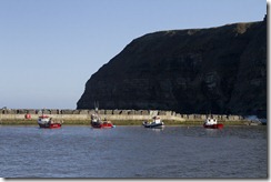
Horizonal 2 

This first image shows the horizon in two different ways, the four boats all on the same level makes a horizontal line, while this is emphasised by the stone pier behind them again breaking the image into clearly divided areas. I’f i’d included more sky or altered the composition slightly then this would also have been working to the rule of thirds.

Horizontal 1

I like this image and the car fills the frame horizontally but also is reinforced with the focus on the line decoration on the car. A close crop in really helps to distract the eye from the car as a whole and just draws it to the horizontal lines.

Horizontal 3

This third image is quite a simple one, I chose the pier supports because I find the eye is drawn into the image at the horizontal line more than the two verticals. I converted this to black and white just for sheer aesthetics as I felt it looked better.

Horizontal 4

I really like this last image as I find that it has three lots of horizontal lines which draws the eye in and across the image. The top lines on the boat, at the bottom of the boat and through its reflection, and then the strip of water is also horizontal. Again I just converted this to black and white as due to the lighting, it was quite close to monochrome itself.
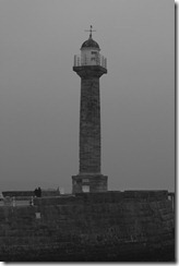
 

Vertical 1

This is an easy image to capture as the subject matter of a lighthouse really emphasises the vertical aspect and draws the eye in and up.
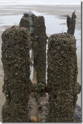
Vertical 2

For the next image, I took a close up image of old pier struts and as they are all vertical, you look at the front subject, then the eye slowly moves back to the other subjects. A close crop ensures that there is no distraction for the eye and viewer.

Vertical 4

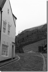
Vertical lines are enhanced in this image due to the buildings, the drainpipe and alleyway leading you in. A conversion to black and white removes some of the distraction of the background in the alley that it had when in colour.
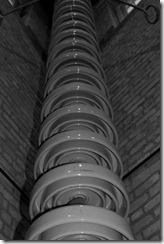
Vertical 3

This is my favourite image, part of a pylon in a museum. I didn’t do any processing or cropping apart from changing it black and white. Not only does the vertical line draw you in but the not very obvious subject also captures the eye.

Exercise: Multiple Points

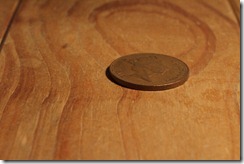
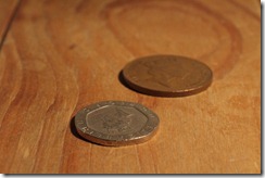
This required me to set up a still life with an unfussy background. I set up my camera on a tripod and decided to use my macro lens with a selection of coins as my subject. The coins were placed on a wooden chest as the background gave a neutral contrast but with some colour and texture still.

I tried this exercise 3 times, each time recomposing and re arranging and the set of images here are my preferred ones.

For the final part, I’ve made a sketch of the shapes and put this into my paper learning log, the final shape of the coin looking more triangular to me tha anything else.


Points 1Points 2Points 3Points 4Points 5Points 6Points 7Points 8Points 9Points 10

Exercise: The relationship between points

The task for this exercise was to find at least two normally occurring situations where there are two points. I did struggle with this one and found it hard to get situations where there were two points, everything seemed quite cluttered and I wanted to use what was already there as opposed to putting a composition together.

RtoP1

For this image I focussed on the points of the boat and the life jacket holder. I feel that the life jacket holder is the stronger point, its not only bigger in the frame drawing the eye in, but it also stands out due to its bold colour.

RtoP3 crop

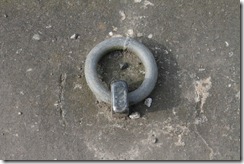
For this image I focussed on two rusty cast iron points, converted to black and white for effect and then just slightly cropped the image to make the eye look in at the two points. I feel that the point on the right hand is stronger, this is mainly due to the lighting being stronger on the metal disc and my eye goes to that first.

Project: Points

Exercise: Positioning a point

For this I had to position a point in 3 different positions in the frame, centre, a little off centre and close to the edge.


Points Centre 

Subject in the centre

Points Off Centre

Subject a little off centre

Points Close to edge

Point close to the edge.

Of all the images I prefer the one where the subject is off to the centre, as I feel the empty space to the left hand side forces the eye to look into the image and draws it into the subject. The last image where the point is close to the top edge doesn’t work for me, i feel its missed its impact and that too much blank space forces the eye to scan around looking for a focal point.