Monthly Archives: September 2012

Assignment 5: Personal Project

Assignment Brief

Produce 10-12 images on a subject of your choosing using techniques learnt within this course.

Background

At first I struggled with this as the brief seemed so wide open that the freedom to choose my own subject actually felt like a hindrance to me. I drafted a number of possible subject areas and then identified the individual areas I could photograph. After some debate with my tutor on finding an appropriate subject that would match the course brief but also be feasible for me to undertake, my original ideas of British icons was put back to a personal project idea and my interest in urban decay and ruined buildings came to the fore. I very much wanted to keep within my specific style of photographing the unusual and this fitted really well. I’m a very big fan of urban decay and exploration with books by Romany (2010) and Margaine (2009) being inspiring, however I have to admit that access and safety issues certainly influenced the locations I would be visiting.

My idea started off as photographing decayed buildings and structures but it evolved after I’d taken some images in the Peak District into a more rounded subject of ‘Forsaken’ featuring anything that had been abandoned, reclaimed (by nature or people) or reused. Forsaken refers to the fact that at some point a decision has been made to abandon or leave a building or item and while at some point there might be re-use, it’s not immediate and not everything gets a new lease of life.

Workflow

I copied the images into a working folder where I could work on these and still keep the originals elsewhere as a back-up. I went through and deleted those that were obviously technically imperfect and those which lacked the impact I wanted.

I then shortlisted the images twice and when I was satisfied that I’d chosen the strongest images based on the composition, technical quality and whether it matched my brief of reuse, reclaim or abandonment. I then used Photoshop CS6 to edit these and my shortlist was 22 images. For the next stage I had these printed and then I looked at them all and chose a selection of the strongest images and those that I liked. For some it was as simple as choosing the monochrome version as it had more punch and a stronger feel of the dereliction and abandonment. I shortlisted this selection down to 12 images which I would then submit in prints and book format.

Presentation

While the brief requires prints to be submitted as part of this assignment, I’d also had an idea about a supplementary method of presentation. When I’d visited the Impressions gallery in Bradford, they had a number of small 6×4 soft booklets for sale and the one that caught my eye and is now in my learning log was on ‘Vacant Possession’ where the photographer Rowan Drury had captured images of properties that had been left but where the residents had left possessions behind. The subject matter of abandoned possessions complimented my chosen area and would be something that I’d like to work in in another project. I liked the format of it and thought that it would complement my prints but also be something that could be viewed on its own. One issue that I found while researching this was that printing a small one off booklet required a minimum number of pages which was more than double the number of images I had to submit. As the booklet I’d seen had a small introduction in it, I then thought that I could intersperse the images with text about the subject to make this viable.

The Images

East Buxton Lime Works steps (reclaimed)

The East Buxton Lime works was opened in 1880 adjacent to the Midland Railway west of Millers Dale Station. The kilns were served by a narrow gauge tramway from the adjacent quarry and the tipping skips were hauled up an incline to be emptied into the two pots. While the production ended here in 1944, the path to the top of the lime kilns is still in place and you can see the old tram track and climb to the top and also go into the kilns. This image shows the steps leading up into the kilns. I also took an alternate image of just the steps which I loved but compared to this one, it didn’t tell a story, and it didn’t suggest that there was a place to explore; it could have been steps anywhere. By altering the composition within the frame and expanding this, I’m making it clear that I want the viewer to think about going up those steps and through that doorway and wondering what lies beyond.

image

Broken door (abandoned)

image1) ©Mick Garratt


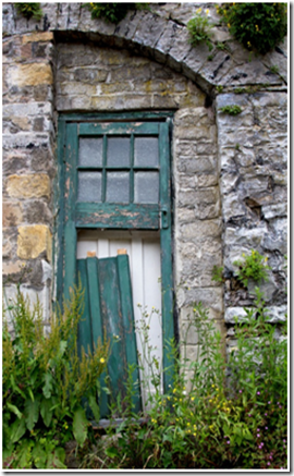
This is part of Dale View Terrace at Cressbrook close to Cressbrook Mill. These was a residence built in 1817 to house apprentices from the mill and was later changed into individual houses. As I walked past, these were sat higher up from the path I was walking on and the green door caught my eye making me wonder why it was abandoned and what was behind it. Attached to the terrace is a Victorian castle folly that was designed to disguise the workers cottages sitting behind this and when I passed it was a café that had closed down.

image

I feel that the colours really work well and grab the eye with the contrast of the green door and the stone of the building surrounding it, it was important that I had the low angle so that the viewer can see the grass and weeds growing up in front of the doorway and the focus on the broken wood as only then does it become clear that this entrance is now abandoned and hints that the rest of the building has also fallen by the wayside.

Monsal trail tunnel

The Monsal trail is the converted Midland railway route running from outside of Buxton to Bakewell. While the route has been open to the public since 1981, due to safety reasons the four railway tunnels built on the route had been closed until 2011 when a full refurbishment of the trail was finished. Now the abandoned and unloved tunnels are fully open and visitors can pass through Headstone tunnel, Cressbrook tunnel, Litton tunnel and Chee Tor tunnel, the route has been lit, paved and tidied up to have a new lease of life.


image2) ©Rowsley Association

LMS Compound No.1050 is seen here passing over Monsal Dale viaduct having just left Headstone Tunnel

image3) ©Andrew Abbott


This image shows a cyclist as I wanted to capture reuse and the change from rail to cycle, giving a new lease of life to the area and the tunnels. While the tunnels are quite heavily utilised by cyclists, I had to wait to get one from the entrance coming in towards me and be ready to capture them at the point I wanted in the frame. I wanted to ensure that from the left to the right there was detail that the viewer would look at. Inside the changes extend to a newly laid flat path and lighting but the grime of the steam era is still present and the individual cut outs in the side of the tunnel are still there. I converted this to monochrome as the original image was almost there with the grey tones and helps to remove some of the yellowish artificial light in there.

image

Stone Barn (reclaimed)

While a derelict or ramshackle barn in the country isn’t an unusual site on its own, this old barn in the Peak District has very much been reclaimed by nature with the trees having grown up through the empty space and missing roof over the years. Nature is very much here to stay. I encountered this on a walk as the path led past it, and while I saw many derelict and abandoned barns, this was the first one that looked most intact apart from the trees in the middle, and it was this unusual aspect that made me stop. I took a number of different images from this one to one that was cropped closer but it didn’t have the same impact and I liked the wider angle view as the viewer could then see the fact this barn was surrounded by other trees and landscape. One thing I try and do is to place an image in the context to help a viewer read the text.

image


Outhouse Manchester (reuse)

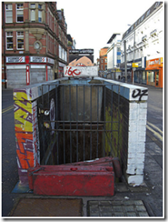
The three blocks that comprise ‘Outhouse’ used to be public toilets. Located in Manchester on the Northern Quarter’s Stevenson Square, Outhouse is an outdoor project space for public art with this being changed every three months.

image4) ©Michael Ely

This was the first time I’d visited this particular area in Manchester and wasn’t expecting to see such a large area of artwork. The strong reds caught my eye and I took a number of images from different angles, my favourite two are here, I like the wider shot as it shows the structure in the context of the street square. You can recognise that this used to be a public toilet but its new lease of life really catches the eye and attracts attention and also provides a splash of colour in the area. I had two different versions of this to choose between, I used Photoshop to draw a lasso around the building so I could then turn the background to monochrome, it was almost there with just some highlights of orange on the buildings behind. I kept the other as it was with full colour and when I compared the two printed versions, I thought that the monochrome version made the outhouse stand out even more and really show it off. In the colour version there was a distraction in the orange Koffee Pot shop front and using the monochrome conversion with the highlighted red area focuses the viewer on what I want them to look at.

image

image

The second image was the artwork painted onto the end, I didn’t do much processing apart from slightly increase the blacks and saturation. I liked this as it could be any building that has been rescued, it’s not quite as obvious as the other as to its previous life and I found that when it was printed out it really catches the eye. The graffiti style artwork can also be viewed in two different ways, a modern way to brighten up an old unused building or as an ugly defacement in a city centre. The ways that viewers will read this differs accordingly as we all bring our own views and opinions to photography and art and as a part of this series I can influence how I want these to be seen through my theme.

Communications pylon (abandoned)

This is a former electricity/communication/telegraph pole that has been abandoned and is now mingling in with the trees. However it is quite eye-catching and still has its original earthing pots and wires attached. While this is off the path slightly, it’s easy to access through the flattened grass so I wasn’t the first person to take a closer look. I converted this to monochrome as I wanted to get a more timeless feel of when it was still working. With this, the appeal is that it’s blending into the trees and is partially hidden, and the conversion to monochrome just helped with making this match the tones and lines of the trees, aiding the reclamation effect.

image

Bowling green pavilion (abandoned)

image5)  © Francis Frith

Bank Park was opened as a public park in 1873 as a welcome green space within an area of heavy industry. Adjoining Bank Hall, later to become the Town Hall, the park features a bowling pavilion that is no longer used and is abandoned and boarded up, watching over empty bowling green’s while waiting long debated regeneration. I tried a number of close up images of different sides of the pavilion but it was hard to see what the building was, with the face on view I feel that the impact is stronger as you see the whole of the building and the full extent of the graffiti and boarding up. The face on view is more a traditional viewpoint that someone would look at or photograph the building. I personally preferred the view from the front and composed the image so that the path was also leading the eye in picture. I tried a mono conversion but the colours brought this alive so I kept to the original.

image


Millers Dale

Miller’s Dale was at its time an important and high volume railway junction used both for passengers moving between Manchester and London via the Midland Railway and agricultural and quarried freight.

image 6) ©John Alsop Collection

Viaduct (reclaimed)

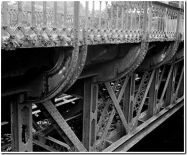
This second viaduct was built around 1905 and was in existence until the line closed to all rail traffic in 1968. Now access is restricted and has been reclaimed by nature as the older viaduct is still open and providing part of the Monsal trail access. This caught my eye as I really like to see plants and grass interwoven with aging metal, and seeing nature reclaiming the bridge gave it a real sense of being abandoned and forsaken. I converted this to monochrome as the pattern of the bridge was really strong and fitted in well with this.

image

Monsal trail via the Midland Railway line at Millers Dale (Reused)

image7) ©Chris Jennings

Since the railway was closed in 1967 the station has become a car park serving the Monsal Trail, although the main buildings remain, being used as a ranger station and public toilets .The station platforms are still there and while there is no railway line anymore, you still get a sense of the route taken. I enhanced the sky slightly using Photoshop and the dodge tool just to bring out some of the clouds and then converted it to monochrome as the leading lines are quite strong and it worked better than the colour version. It has a very lonely feel to it with no people or action taking place which is exaggerated by the strong sky and the monochrome colour.

image

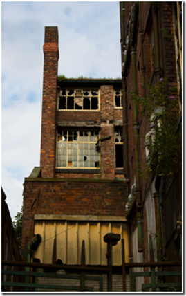
Garnett’s Cabinet Works (abandoned)

image Copyright unknown

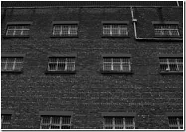
Originally built in 1890 and added to over subsequent years, the building that used to be Garnett’s cabinet works has been abandoned for years and is slowly getting more and more derelict. There are parts of the building that have collapsed over time and now the safest way to see this is from the outside. It’s hard to get a clear view from the front of the site as it’s fenced off and partly obscured. I went around the back where the safer part of the building is, the windows are broken but the building looks quite intact and from this angle you don’t get an indication that it’s derelict with rotting floors inside. The dereliction is more obvious when I moved towards the end building. I kept this in colour as I liked the light, it was early in the morning and the sun was up so there is a golden glow. There was a telephone wire stretching across the middle of the image into the sky that was obvious so I used the clone stamp tool to erase this. Where there is a wire lower down, I’ve left this in the image as it’s not as obvious and to clone it out would be more obvious than leaving it in. The light is highlighting just where I wanted the viewer to look, as you then notice the darker building to the right of the image, secondly to the face on building in the light.

image


image

Summary

Now I’m looking back at this project, I feel very much that this is just an opener for a piece of work that fascinates me and one that I will continue with as I’d like to extend this into a larger body of work. One of my reflections is that it’s important to keep an open mind as some of the buildings and locations that I expected to work just didn’t and others had a really good impact that I didn’t fully see when I took the image. I did take my time with this, I took a lot of the images early in the process, planned visits and repeat visits and then spent a lot of time viewing the images both on a PC screen and also printed considering which I liked and which worked. It took some time to research and to write up and I also had a couple of weeks delay whilst waiting for responses on the use of some photographs that I wanted to use to show how the sites used to be. I was conscious that I needed to give owners of the photographs time to come back to me with permission usage too, and at the time of finishing up this assignment I was disappointed not to have received any responses, although where a website has had open information on the re-use of photographs this has been a great help.

While I initially thought that the open brief was too challenging, it helped me to work through what I liked, what I wanted to photograph and to know that sometimes an idea has to be put aside at times to be picked up later. As much as I enjoyed the content of this, it was equally important for me to learn the processes of a project and to follow these through from the conception through to the printing and presentation so that I can apply these to further projects.


Other Images

As a sample of some of the images that were part of the series but I rejected in favour of the others.

Bibliography

Badger, Gerry 2007. The Genius of Photography. Quadrille Publishing

Barrett, Terry. 2012. Criticizing photographs: An introduction to understanding images. McCraw Hill. 5th edition.

Drury, Rowan. 2001.Vacant Possession.

Margaine, Sylvain. 2009. Forbidden Places – Exploring our abandoned heritage. Jonglez

Romany, WG. 2010. Beauty in Decay: Urbex: The Art of Urban Exploration. CarpetBombingCulture

Photograph Credits and Copyright Details

1) Broken Door- Apprentice House, Dale View Terrace ©Mick Garratt via http://www.geograph.org.uk/photo/2422398

2) Train over Monsal Dale viaduct. © Rowsley Association via http://www.disused-stations.org.uk/m/monsal_dale/index17.shtml

3) Closed tunnel (Monsal Head Tunnel) ©Andrew Abbott via http://www.geograph.org.uk/photo/1787982

4) Outhouse/Public toilet Stevenson Square ©Michael Ely via http://www.geograph.org.uk/photo/1082257

5) Bank Park Bowling Green © Francis Frith Collection

6) Millers Dale ©John Alsop collection via http://www.disused-stations.org.uk/m/millers_dale/index.shtml

7) Millers Dale ©Chris Jennings via http://www.disused-stations.org.uk/m/millers_dale/index40.shtml

8) Copyright unknown

All of the above work available via http://www.geograph.org.uk is licensed under the Creative Commons Attribution-Share Alike 2.0 Generic Licence. To view a copy of this licence, visit http://creativecommons.org/licenses/by-sa/2.0/ or send a letter to Creative Commons, 171 Second Street, Suite 300, San Francisco, California, 94105, USA.

Web Gallery

I have to admit that I skipped this exercise, only due to the fact that I’ve had my own website with different galleries on it for around 4 years and feel that through maintaining and updating this, I’m covering the requirement.

My website is at http://www.saltwickstudios.co.uk

Exercise: Sharpening

Take an image that you have processes as the reference standard, with some edge detail and some smooth areas. A portrait is ideal, and ensure that you have applied no sharpening.

Make three more versions, each with a different degree of sharpening, make sure that the weakest of the three is quite close in on-screen appearance to the unsharpened original and that the strongest is noticeably aggressive.

Print all four at full size and with neutral lighting next to the computer screen compare these with the 100% magnified version online. Write down the differences and which is most appropriate to my taste.

1) No sharpening

2) Sharpening at 35%

3) Sharpening at 80%

4) Sharpening at 150%

When comparing the images, its easy to see that with over sharpening comes increased image noise and at 150% when viewed at full size, this is very noticeable and I feel degrades the image. Personally I prefer no sharpening or at the lower end.

My preferred image- no sharpening

portrait 1

OCA Residential Study Weekend 1st and 2nd September

Reflections

Well it’s a little bit late in coming but I’ve finally got around to putting some of my reflections from the residential weekend onto paper (or screen) While it’s a couple of weeks since we were all there (it seems like a lifetime away now) there are many more blogs detailing the speakers and the subjects so in order not to replicate these, I’ve gone for what’s stood out for me.

Arriving in Leeds and First Night

I arrived a little later than planned travelling from work but wasn’t disappointed by the hotel, I had reservations about my room being on the ground floor near the lift but it was lovely and quiet and so plush. Although it was so large I felt a little lost in there. After dropping my stuff I went exploring in Leeds but was disappointed by the drizzle coming down that stopped my plans of an evening stroll with the camera. However I did take the free time to do some valuable work on assignment 5 of DPP and to rid my head of all things work related prior to the two days. I’d initially planned to travel up on the Saturday morning but changed it to the night before and I’m glad I did as I think this certainly cleared my head and put me in the right frame of mind for the weekend.

The hotel

I’d located the hotel a week before when I’d been in Leeds so I knew where it was, while the Friday night in the bar was crazily busy early on, for the rest of the weekend it was quiet and the opportunity to spread out and have the free space at break times and during the portfolio session was really helpful. It felt like a good place to study and certainly had plenty of charm. While we didn’t have drinks provided with the lunches (some juice might have been nice) the food we had was more than adequate with chocolate brownies at break and bowls of chips to fuel us at lunch. I did also learn never to dip a hard biscuit too after it decided to break and there was no elegant way of retrieving it! I certainly felt we were well looked after which we might not have had if we’d been in a chain hotel. I’d definitely return!

The conference facilities

The room was a little small and cramped at first, especially with the cameras and lighting set up for the filming. After a shuffle about where we moved the chairs into a more relaxed configuration we did have more space. Things were a little tight for space (and time) with the book review session, the patio door brought some welcome fresh air into the room and some unwanted air noise from the flights overhead! Only on the Sunday when we’d all checked out did the size of the room become a problem, people plus luggage and cameras made it more of a squeeze so a room to safely store the luggage would have been helpful, even if it was just extending the lease of a hotel room to share.

Day 1 (Saturday)

The first part of the day began with an introduction from all of us and what we wanted to get out of the day and then we progressed to a session on moving between the levels as we seemed quite a mixed group with people at all different stages of completing level one, two and three courses. While this was quite an interesting session, I did feel that coming to the final course within level one that I would have liked more of what I need to do to improve and I found that I was still wanting to know more about how I can improve and specifically more on the academic writing to accompany my work as opposed to presentation for assessment. However on the positive side we did get some tips from Peter during the portfolio session that I can use.

Guest Speaker- Mishka Henner

I wasn’t sure what to expect from Mishka Henner, I’d looked at some of his stuff online such as the Less Américains work and I have to say that it just didn’t grab me so I went into this session with no expectations and I have to say that I totally changed my mind after hearing him speak.  Henner essentially uses the images available to him through sources such as Google street view and forms these into coherent series such as the Dutch Landscapes and also No Man’s Land. A lot of the discussion was about the appropriation of images and whether there had been any communication or agreement between Henner and Google for the use of these.  The ideas he has and the output through websites and books were quite refreshing and he does seem to have a number of ideas bubbling on the surface. We got a very real world talk on the pitfalls of his work, the high cost and low turnover of his book sales and how he can be subject to vitriolic criticism through the internet for some of his work. I appreciated his honesty and openness and certainly came away from the session impressed. After all the email debate on speaker to choose and different options where I very much had my view from what I like and what I want to hear about, I have to say that Henner was absolutely the right choice and thanks to Eileen for her hard work in sorting this out.

Tutorials

We ended the day on a photobook workshop, splitting into groups and reviewing a number of photobooks against a criteria list we were given and for the final book we were given saying a few words about our findings. While this was interesting to get my hands on some books that I hadn’t seen before and to think about them as a whole, so considering the text, the layout, the size, the material of the book etc. as well as the images in how it projects the work as a single product. There were some downsides with this, we managed to break out as small groups so weren’t restrained to being in the room, however I found that we didn’t have enough time to look at the book effectively and to read the introductory text within, also as we were in groups of 5, we didn’t all get enough time to look through the book before we had to form our ideas and then move on. In the end it was Gilly from our group who spoke most on this with some contribution from me. I liked being introduced to some different books and would happily have spent more time looking through them, I can see ways of improving this session if we were to do it again and I think that the biggest issue was time and number of students per book.

Day 2 (Sunday)

Peter Haveland “Semiotics, symbolism, and metaphor”

Our Sunday began earlier than the Saturday had and at just after 8 I managed to make it down for breakfast, we all seemed a little quieter than we had on the Saturday and I felt this continued into the first session but I think we all needed a bit more time to come round and some more coffee. After all 9am on a Sunday morning for a lecture on semiotics didn’t sound like the best of plans. I was worried about whether I’d stay awake, not because I wasn’t interested but I’d done the student thing of going out the night before, making the most of a night in Leeds, I went celebrating my best friend’s birthday at a rock club, which unfortunately was much better than expected so I stayed later than planned. Despite only having around 4.5 hours sleep, I survived and the session from Peter was quite interesting.

It wasn’t what I expected and at some points did seem to be stilted and rambling but I enjoy listening to tutors and I could see where the subject of semiotics could be useful. We got some recommendations of some books to look at and I’ve since sourced a couple of my own from the library to give me some more background. I think I would have liked there to be more emphasis on reading our own images and how to convey this when we write about them though, but hopefully I’ll be able to do more once I’ve got some background reading out of the way.

As an update on this since my original draft, I actually picked up an introduction to media studies book that gave me some pointers too and was very much an overview of some of the topics we touched on in this session.

Jesse Alexander “Genesis and evolution of a major project”

I hadn’t previously met Jesse before this event nor had experience of him as a tutor so I was coming to his work quite open and without any previous knowledge. He spoke to us on his MA project ‘Threshold Zone’ which he had started and evolved and changed through to presentation of this on light boxes and inside caverns. The overall subject area of underground really fascinated me, while Jesse spoke of how he found these spaces uncomfortable and challenging to be in, it sparked thoughts of exploring urban areas and urban decay, themes that were running in my head for the project that I was working on at the time.  We also saw ‘Turnstile’ an artwork comprised of a series of photographs from an abandoned nuclear bunker (again an interest topic for me) that he’d put to Patrick Allen’s narration of the Protect & Survive public information videos from the 1970s. Not really being old enough to remember the cold war fear, I found that the juxtaposition of the abandoned bunker combined with the advice on what to do in the event of a nuclear explosion and what I can see now as useless and naïve advice on keeping safe quite chilling and showed that while photography has an impact on its own, this can be enhanced and added to by the appropriate narration or soundtrack.

I came away from Jesse’s presentation wanting to know more and it’s certainly something I’ll be looking into when I have some more free time.

Guest Speaker- Peter Rudge from Duckrabbit

I went into this session without much of an interest in film; I have to admit that for me I like still photography and have never really had the inclination to extend this. Peter came across as a really interesting guy and I could have listened to him for longer. It was hard hitting at times as he showed us some example videos such as the Médecins Sans Frontières (MSF) one with a pregnant young woman who has to be driven over severely uneven ground to the hospital, so much so when the 4×4 hits a large hole and vehicle bounces we are left wondering on the impact on her and if she and the baby will make it to the end of their journey. It certainly opened my eyes to a different use of photography, the mix of stills with text and a soundtrack overlaid but interspersed with video really helped to hit the point and I could see where this would work. At the moment time and resources don’t allow me to pursue this but I won’t rule it out for the future and it could be an interesting extension of my work.

Portfolio Session with Peter Haveland

This was the one session where I felt I was prepared and then at the start of the session seriously out of my depth. I knew that for assessment my images needed to have a white border and not to be presented in sleeves. However as mine were printed to the edge, I’d put them in portfolio sleeves in order to be able to transport and handle them. Suddenly seeing everyone’s work out of sleeves and with borders certainly made me feel less than prepared, even more so when I realised that I was the only person who had brought a selection of images that weren’t in a cohesive series. As a result I felt that I didn’t get great feedback, in fact by this point most of the obvious comments on presentation had been made a few times to the other students so there wasn’t really much left to say anyway. I was really impressed by the other students work; some of the images were stunning and so imaginative. Just being able to see these in person and close up was so beneficial. We were in the atrium so had a nice amount of light coming down, I’m not sure the other students had the same conditions and it might have been useful to have seen their work too. The comments from Peter were once again more than useful and very insightful on what happens at the assessment events and having only been through one so far, tips on how best to present and improve are always welcome. Since the weekend I’ve printed some different images for portfolio review and feel I know better on how to present my work which I wouldn’t have been aware of previously.

Wrap Up and Journey Home

At the end of the sessions we all squeezed back into the main room to just recap and to thank everyone and then it was all over and time to head home!

Despite getting to the station in plenty of time, the train was delayed so I spent about 40 minutes waiting on the platform, head crammed full of photography ideas and thoughts. Once I was on the train I managed to get some draft notes written up on my thoughts so that I could share them with the rest of the group and to try and make sense of everything that I’d seen and heard.

Final Thoughts

Taking a weekend out to spend with a lot of people I didn’t know and a few I’d only met either online or at study visits was quite daunting and when I walked down to breakfast on the Saturday morning I felt a little bit nervous. Once we’d all started chatting this soon went out of the way and we all got on surprisingly well in both the short space of time and the smallish meeting room. I feel that I didn’t quite get around to speaking to everyone but I think I made some new friends out there.  It was more than worth it, and while it was a long weekend the schedule was certainly manageable but that’s possibly a benefit from the fact we had all committed ourselves in both time and money and were all open to getting the most out of the weekend.

So famous last words on the weekend? I can’t wait for next years!

Personal Best-Paul Floyd Blake at the Impressions Gallery Bradford

Exhibition Visit 22nd August

This was the first visit I’d made to the Impressions gallery and I was impressed by how light and airy the building was (as well as the selection of books in the shop) The exhibition itself was just in the one room but managed to comprise of a number of photographs charting athletes in the build-up to the 2012 Olympics and Paralympics.

At first, I wasn’t overly impressed just looking at these images, usually 4 per athlete but then you read the information and realise that it’s an image per year, and then I stood back to see the subtle changes in the subject over this time period. This was really enlightening to see young athletes grow into young adults and in some cases to see the tiredness and strain on their faces. In contrast to the images recently in the newspapers of all the medal success, this was very much a different look at the years of dedication and hard work, that in some cases isn’t realised as funding is withdrawn and the athlete has to make the difficult decision to stop. Overall it portrays a sense of the sacrifice that hundreds of people make to get to the successful medal winning stage as that’s not always obvious in the media.

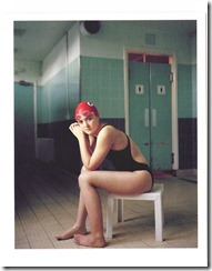
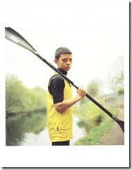
Looking at the portraits, these are not just faces of the athletes but they are carefully composed to show their sport whether it’s in the background such as sitting by a swimming pool, or in their dress such as judo, the sport it there but it’s the person that’s at the forefront and what the viewer is interested in primarily.

One of the images of Rosie Bancroft won the 2009 Taylor Wessing Photographic Portrait Prize and was the first time I’d seen a winner of this award so that was really beneficial to get an idea of the type of image and composition that can win accolades.

For me this was thought provoking, more for the subject matter than anything else, I like a more realistic and gritty portrait and this shows both the emotion in the subjects but also conveys it to the viewer so we get an insight to a life most of us will never know, and an honest portrayal of sport funding that again is not highly publicised. On the flip side I would have liked more information with the images; I want to know what Floyd-Blake thought and saw as these people changed over the course of 4 or more years.

ig1 Rosie Bancroft (Swimming) 2008

ig2 Robert Jeffries (Kayaking) 2007

log1 007

Exhibition at the National Media Museum, Bradford

In the Blink of an Eye is part of imove, a Cultural Olympiad programme in Yorkshire.

The purpose of this exhibition was to explore the relationship between media and movement, and how artists and photographers have responded to this through different times and technology from  the 1800’s to modern day through a mix of media such as photography and video. I was looking forwards to this exhibition and seeing some of the ways in which motion had been captured photographically and its evolution.

Some of the most famous examples of movement were in the work by Eadweard Muybridge, but just seeing the series of images didn’t help to convey movement to me at all. I was more impressed by the work of Etienne-Jules Marey who had worked through photographing movement, using models of birds in flight through to his very modern invention in the 1880’s of a motion capture suit.  Marey seemed to be very forward thinking in his work to understand movement, his invention of the black suit with white lines down the arms and legs which reduced movement from a visual form to a graphical representation that could be analysed is technology that’s still used today, albeit improved to capture even more with reflective sensors.

Gallery two was more interesting for me as it featured more photography including slow mo, images with fast shutter speeds capturing the action and freezing it, and then slow shutter speeds were you see some of the subject but there is more motion blur and shape leaving a very ethereal and ghost like presence.

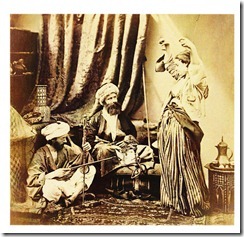
Looking at some of the images, it made me think of how photography has gone from being carefully measured taking as much time as it needed to now being disposable and fast, and I feel that a balance needs to be made between the two. I’m glad that when we’re taking portraits and people in action images that technology, both film and digital, have moved on where the subject doesn’t need to hold a pose for minutes. Looking at ‘Pasha and Baydere’ by Roger Fenton is a good example of this as the dancers wrists are tied to the ceiling with rope. I’ve included this postcard of the image as it shows where our photography has come from and the improvements made over the decades.

Overall the exhibition was interesting but it felt a little disjointed spread over two galleries and with the mix of film and photography, some of it didn’t flow as it should have. On the other hand some parts were inspiring; the milk drop by Harold Edgerton was something that I might experiment in replicating myself at some point.

nmm1nmm3