Category Archives: Exhibitions and Events

Look 13 festival visit part 2

IMG_20130528_190836

I took advantage of the bank holiday weekend to visit some more of the galleries and exhibitions that are part of the Look 13 photography festival.

Wolstenholme Creative Space

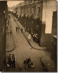
‘Liverpool, Unfinished’ by Rob Bremner

I knew that I wanted to visit the Wolstenholme Creative Space to see ‘Liverpool, Unfinished’ by Rob Bremner as it has a very limited opening run. While it was further down Slater Street than I expected, the gallery space was signposted although when I arrived in the middle of day with bright sunshine, looking inside the dark space and empty room was a little concerning. In reality I had the preconception that I’d be looking at hung images, instead I was in a cool darkened space similar to being in a cellar and I had the whole place and slideshow (real slide negatives too) to myself, apart from the festival volunteer. With no light or anything to distract it was easy to focus on the images. While some whizzed past quite quickly and I would have liked to have studied them in more detail, my attention was purely on the content. Very much in the vein of Tom Wood, Bremner features a mix of different people and families in 1980’s Liverpool. A lot of the buildings and places seemed run down and tired, well before the huge regeneration projects, and while the fashions left a lot to be desired, I did wonder what had happened to these people, especially the young families and children. There was also a running though out which seemed to be very strong older women, looking like they had both physical strength and strength of character that you wouldn’t mess with. The images won’t set the world on fire, they are very much of a time and place that has been covered by other photographed but for a well composed snapshot into how Liverpool once was, it’s really worth seeing, and it’s a shame that Bremner has never finished this as I’d love to see the next generation of images that future exhibitions will show.

Further info and a sample of images at

http://www.guardian.co.uk/artanddesign/gallery/2013/apr/19/liverpool-unfinished-rob-bremner-photography

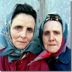
clip_image002

I love this image, it’s from the festival programme and I wouldn’t upset these ladies.

I did try to get to the Museum of Liverpool but the Battle of the Atlantic festival was on and it was a struggle moving around the docks area. I then headed to the Open Eye gallery for their new exhibitions.

The Open Eye Gallery

DSCF0267DSCF0268

There are two artists exhibiting inside the Open Eye Gallery, downstairs showing different series of work from Charles Fréger which is called ‘The World and the Wise’. Underneath this overall heading are five different bodies of work.DSCF0270

‘The Wild and the Wise’ by Charles Fréger

‘Wilder Mann, 2010’

DSCF0272

The ‘Wilder Mann’ series involved Fréger visiting and observing 50 communities in 18 European countries, observing the different rites featuring traditional costumes and rituals that form part of the ‘wild man’. The images were all quite different, while the overall theme was evident, each country had a different take on the tradition and festival and it was only obvious when reading through the supplementary information that the history and different countries came out. I found that it wasn’t easy guess what some of these were and I found myself looking at the landscape more than the costumes trying to guess the background. As a series, I found it visually striking, I didn’t like the content of the images but I know that it’s just my personal choice and I can see that they are well composed and interesting. Some visitors while I was there just gave them a cursory glance, decided they didn’t like them and moved on. I’m not a fan of Fréger’s work but that’s my choice based on what I do and don’t find aesthetically pleasing and with my student head on it’s very interesting to look at and to notice the detail and wonder about the stories. I could see the running theme of identify through all of the images.

‘Penitente, 2004’

The back wall of the gallery was taken up with two large images of hooded figures, while it’s very hard to see any identify there, you can still see their eyes so feel a sense of personality in there even though you’ve nothing else to measure them on.

‘Legionnaires, 2000-2001’

DSCF0274

This series consisted of 9 uniformed and 9 naked legionnaires, without the uniform, the identity is removed and you don’t get any indication of their background or who they are. For me I feel that their identity is within the uniform and they cannot tell their story without it.

‘Rikishi, 2002-2003’

This was the series on sumo wrestlers, my thoughts on this are very much in the same vein as ‘Legionnaires’. There were different costumes/outfits but I didn’t get a sense of coherency with these, I felt they were different portraits of people who do the same thing but that I didn’t feel it was anything more and that other series by Fréger told the story better than this one.

Other work in the exhibition included:-

‘Hereros, 2007’

What really stood out for me with this and linked the series was the splash of red that each subject whereas, some wear a lot, others are just a hint but this really catches the eye (and returns to an earlier post I made about the colour red and its occurrence in nature) and for me ties the whole set of images together.

DSCF0277

‘2 Nelson, 2004’

This is a series on wrestlers and I found the composition more interesting that the content. The action all happens in the lower third of the frame and this is repeated through all of them, so they essentially all have a cream backdrop and most of the movement is on the blue mat. They have been composed so that there are heads and feet etc. outside of the frame. I feel that this was the photographer’s choice to show these where the subject is not square in the frame as it adds to the sense of action and movement and you can almost imagine them rolling out from one frame to the t next. Does it fit in with identity and who do I think I am? I’m not sure as part from showing two people at a pastime, there isn’t anything there that say identity to me. No more so than a photograph of myself in gym gear would give many clues away about myself.

DSCF0280

‘Short School Haka, 2009’

I’ve seen the haka performed and know what it consists of, within this series, the images are linked with the themes of the dance and the school uniform. I felt that the bright primary colours of the uniforms gave these images their impact.

‘Drape’ by Eva Stenram

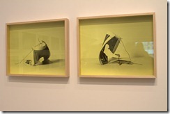
The second exhibition within the Open Eye gallery is ‘Drape’ by Eva Stenram, based on found images of pin up style photographs. The accompanying text with the exhibition states that ‘In the Drape series (2011-2012), the background- the drapes that give the show its title- and foreground are exchanged, Once the backdrop falls in front of the model (negating access to the subject and only showing glimpses of her objectified body), the viewer becomes fully aware of their voyeuristic desire and erotic impulses’

I felt from looking at these that any eroticism had certainly been removed, turning these images into more of a puzzle of to what the pose and outfits (if any) under the drapes would have been. In place we get what now seem to be strange poses and disembodied limbs which felt more humorous to me than anything else. I disagree somewhat with the statement that says now the images are covered, you become more aware of your feelings towards the subject. Having never seen the originals, I don’t think a viewer would come into this with any erotic impulses, and seeing the subjects covered and not having seen the original certainly won’t embody the view with voyeuristic desire as you don’t feel you are intruding or seeing something that you shouldn’t be.

DSCF0288DSCF0284DSCF0286DSCF0287

The Bluecoat

‘I exist (in some way)’ Various Artists

IMG_20130528_190812

‘I exist (in some way)’ features the work of photographers who explore, frame or reveal constructions of personal and collective identity in the contemporary Arab world. This description from the festival programme sums up the varied artists and work featured within this exhibition. I went through and looked at it all, and made notes about the pieces that really interested me. The first part I saw of this about a week before was by Laura El-Tantawy and while it was only a quick visit between events, I really enjoyed her work and found it stimulated me to think about the background of the people featured in the event. On the second visit I noticed more, there was actually a soundtrack playing which I think was of music and voices in Cairo- again I’d need to revisit, and I saw the background information on the theme of the images which was to present a view of pro-democracy subjects in the Tahir Square and surrounding streets during demonstrations. What I saw in the faces of grief but hope, was not from a loss or war, it was from passion to change their society. Knowing this doesn’t change the images for me, however it makes them easier to study as if I’m no longer intruding into a private moment.

DSCF0293DSCF0294

I won’t summarise all of the work that I saw within this, just some key ones that I felt were worth a mention.

‘Through the looking glass’ by Lamya Gargash

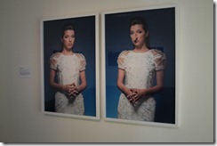
Throughout the series, this really stands out as a different take on identity and how we see ourselves, and how we feel others see us. These feature two portraits of a subject, the first one is a standard portrait, and the subject is standing up against a coloured background. As portraits go, these are just normal people being photographed. Next to this then is a modified portrait where the subjects perceived flaw such as eye bags or a large chin have been exaggerated to monstrous proportions. When looking at the image of Lindsay, or Jimmy, I don’t notice the flaws that are exaggerated yet I can put myself in their place and think my flaws are hugely obvious. It’s a very sobering reminder that we’re not perfect and the only people looking for perfection are ourselves, when looking in a mirror we are our own harshest critics.

DSCF0300

‘Mother, Daughter and Doll, 2010’ by Boushra Almutawakel

This piece of work is exploring gender through the overlapping viewpoints of Almutawakel, as a mother, a Muslim and a Yemeni woman, using different clothing from and differing levels of veils to cover up. I was really interested in the series of images and how the demeanour of Almutawakel and her daughter changes through each one. The first image is very colourful and positive, and with each change from the positioning of the veil/headscarf, the subjects seem to withdraw, they look more serious and by the end of the series when the veils also have an additional veil over the eyes and they are wearing gloves, it’s very hard to read a person from just the eyes. The final image is just of a black draped box and background, no sitter there at all, they are invisible. Reading a little more into this after I’d visited, the series focuses on the different levels of covering up that women can be expected to undertake, and while there are advantages and disadvantages of wearing a full hijab, the point is that the choice to be veiled should be up to the individual, not society or circumstances defining how other people should look and that comes across. If you look at the free choice in the first image, the artist is obviously more comfortable than later on when fully veiled and gloved. It’s certainly thought provoking as someone who has had the liberty to wear whatever I’ve wanted over as I’ve grown up.


DSCF0302

Almutawakel also has some images in this exhibition entitled the ‘Fulla’ series, an Islamic version of the Barbie doll. This stood out as an interesting series for me, I loved Barbie and other dolls when I was younger and can see this as an interesting introduction to a different culture and westernised view. It’s certainly something that I’ll keep an eye and follow as I’d love to see where the character goes next.

‘French Muslim Women’ by Laura Boushnak

France has the continent’s largest Muslim population and this series features a wide range of women from differing ages who have converted to Islam and their lives as they bridge their new religion with traditional French society. The standout of these was that fact that Boushnak had captured the everyday normality that these women were taking part in, such as the outside exercise class and waiting for a train. These aren’t images about Muslim culture or being French, these are images that show whatever nationality of faith you are, we all do the same things.

My final highlight of this series was ‘Nation Estate’ by Larissa Sansour.

As I walked into the furthest gallery, my eyes were immediately drawn towards the Nation Estate poster that very much reminded me of ‘Metropolis’, the concept of everyone living in one huge skyscraper with different cities on each floor and it all being very futuristic really appealed to me. The large format images stood out and while they are very much composite images, they stimulated me into thinking what it would be like to be in a place so controlled that it was all in one building. Would I go stir crazy not being to get out and see something outside the skyscraper?

DSCF0312DSCF0315

Other Images from the gallery

DSCF0304DSCF0305DSCF0310DSCF0317

Sander/Weegee: Selections from the Side Photographic Collection

The upper gallery was split between a selection of images first from Weegee and then from Sander. I’d seen a couple of images from Weegee before in exhibitions but this was the first series I’d seen. Sander as a photographer was new to me, having only seen a couple of examples within books. The images from the series ‘Naked City’ were my favourite ones, really captivating and showing the ups and downs in people’s lives. The snapshots of the people and the city were fascinating, not glamorous and I felt quite gritty in both substance and the black and white film used (while this was the only affordable choice, it does add character in my eyes) The subject matter is not always easy to view, I found the building on fire more shocking by the advertisement that says ‘Simply add boiling water’ immediately linking the heat of the fire with the water being poured onto it. While looking at these images and seeing the tragedy in them, such as ‘Police helping wife of a murdered man’ isn’t always easy, they are one of the more interesting sets of street photography I’ve seen.

The Sander collection featured a number of portraits from working people such as a varnisher to circus artists. I had to guess about these people, some seem to be in a context that gives some clues whereas others are not. I think I would have liked to have seen some more images in the series, from what I did see, I liked a couple of them but the images from Weegee were more interesting to me.

The Walker Art Gallery

There are three exhibitions on at the Walker art gallery, I managed to see two while I was there and will go back for the portraits from the Keith Medley archive.

Every Man and Woman is a star featuring Martin Parr and Tom Wood

This features a mixture of images from both Parr and Wood. I’d seen a few of the Wood photographs the previous week at his talk so didn’t really focus on those too much as I was quite familiar with the all zones of peak and Chelsea reach nightclub images. I found it quite interesting to see Parr’s work in black and white compared to his usual saturated colour and to see his quite understated Irish scenes. I think we all have a preconception about how Parr’s images look and to see something a bit different was worth the visit.

DSCF0322DSCF0323

Alive: In the face of death by Rankin

This was one of the exhibitions that I was most keen on seeing, I’d never seen anything exhibited by Rankin before, only magazine images and the changing gallery exhibition space in the Walker always puts on excellent exhibitions so I was looking forward to seeing a challenging body of work.

DSCF0333

The exhibition welcomes you with a stunning image of Sandra Barber, which has been used for the cover publicity. She’s striking to look at, not because her hair is at a just growing back from shaved stage, but her strong black eye make-up as a mask and the feather collar really grab the eye. The accompanying text says that she’s showing her inner warrior and I have to agree, she looks strong, confident and inspiring.

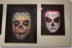
Moving from this into an area with a series of ‘death masks’, based on the ‘day of the dead’ tradition, these are a series of images that come across as sugar coated and acceptable in a world where the skull is just another fashion symbol. These are striking to look at and throughout all of these images I see the highest quality, both in how technically perfect they are and the composition and colours.

DSCF0329DSCF0331

Moving into the main gallery, there’s a mixture of themes, people who have survived a life threatening illness or event, life masks to celebrate the living, people who work with death and people who have a disability or illness which impacts them. Looking at the subject title, I expected this to be a little bit uncomfortable, but after spending some time in there and taking it all it, I get a feeling of strength, hope and positivity. It’s not negative at all and celebrates sheer strength of character. Some of the most eye-catching images are a series where the entire subject and background are coloured such as blue or white, while these were people who had been ill or had a near death experience, this didn’t come across, the use of the one colour all over them focuses the viewer, you don’t see their baggage. Reading their stories you feel their strength and their fight.

DSCF0319DSCF0327

The life masks were interesting, having seen historical death masks previously in museums, the idea of a mask of a living person taken possibly when they are still youthful and vibrant is something to be celebrated more than capturing a death bed likeness and reminds us that life should be celebrated while we can. Some of the subjects have a disability or have an oxygen tube in the photograph, I notice these as I spent time studying each image, yet the notes I made were that even when you see that, you don’t really see it, you look through to the person and each image radiates strength.

Since coming back from this on Saturday I’ve been researching this more and looking at the stories behind the shoots and behind each of the people featured. On the ‘Alive’ blog http://alivexrankin.co.uk/blog/ it was announced that a week ago, one of the subjects Louise Page lost her fight with cancer. Her images were a set of feisty portraits in a Vivienne Westwood gown where she is smiling and then crying, even with smudged mascara and tear stains she looks like she’s fighting. That’s what I want to take from this exhibition, when faced with adversity, tragedy and pain all we can do is keep smiling and keep strong and powerful, and never stop fighting.

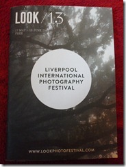
Liverpool Look 13 Photography Festival Opening Weekend

DSCF0164

Thursday 16th May

As part of the opening weekend of the Look 13 photography festival, I’d had a mad moment and booked onto a few events. While I couldn’t attend the full symposium on the Friday, I did take some time off from work to attend the events on the Thursday, and the talks being held on the Saturday. These are my summaries of the events I went to, I took loads of notes, saw loads of images, heard lots of people talk and I really enjoyed it. I’d almost moved into the Bluecoat over these two days and found the mixture of activities put on by Redeye and Miniclick (as well as all the other people involved in the events) so worthwhile, excellent value and something I’d be very keen to attend again.

Portfolio Review

I had my first portfolio review outside of my peer group as part of the opening weekend of Look 13. Whereas I’d previously shown my work to fellow OCA students, this was the first time I’d shown anything to a critical stranger. I’d only booked one session as I wasn’t sure what I wanted to get out of it and how critical it would be. While I did have some bodies of work to show, I wasn’t looking for advice on where to take the projects next.

I took three bodies of work that I’d previously taken and submitted for my OCA coursework including the Battle of Nantwich series on people undertaking an activity, my ‘stone’ series and my ‘Forsaken’ project. Of all of these, the one that I will continue to work on as it interests me and I feel is the way that I want my work to go, is the ‘Forsaken’ project. My reviewer was Petra van den Houten from Redeye photographic network.

My supplementary information that I was asked to provide in advance, I found this harder than actually going through the review.

What kind of work you do

My style is quite varied; I do wildlife, architectural and urban images mostly. I’m working on my own personal style and tend to focus a lot on quirky and unusual subjects. My weakest area is portraiture and that’s something I’d like to improve on

Response

We discussed portraiture and how it wasn’t an area I was naturally inclined towards, I wanted to try it but it didn’t come as easily to me as other work. Petra’s advice was to try it if I wanted to but if it wasn’t a strength area for me, to look at what I am good at and enjoy and to pursue these. Good portraiture photography usually requires professional models and lighting, both of which I don’t have.

Of all of the images, the stone series didn’t really get a mention; I guess they are ok but didn’t catch the eye as much as the others. I should focus on my strengths which are the more unusual/urban type of images that I’ve produced so far. While I didn’t think that my personal voice was established enough and I felt that I was still trying to find it, it was clear here

Where you are up to in your career

I’m in a different career at the moment and am currently studying part time for a degree in photography. Ideally I’d like to move into a more creative career path whether its full time or just getting my work published, exhibited and used. I’ve had some images printed in magazines as part of voluntary work, the Urban Design Journal, and the Big Issue in the North.

Response

We discussed ways that I could get more noticed and how to promote my work with a focus on the local area. Other ways of producing work were discussed too- the little 6×4 book was favourably reviewed and a mention of images that could work as postcards if I could find a partner to publish/stock these

What you want from the session.

I’d like some advice on what I should be presenting in a portfolio, can I show that I have variety or do I need a coherent style. I’d also like to discuss how to get my work better known, how to get it seen and discuss finding a ‘personal voice’

I’m not expecting that my work is the finished article, but I am open to advice and criticism as I want to improve and see this session as a step towards this

Summary Comments

– Was viewed upon favourably, Petra told me that if she doesn’t like something, then she would say so and she was positive about the content of the images and also the printing of them

– Contact local press and see if I can get a series of images published in there

– Consider a narrative with the images as this worked well in the book

– Research costings- printing/posting/mounting etc. so that I know what to charge for selling my work

– Always get credited even if you don’t get paid

– Have a blog (I have my blog for OCA which also has other photography bits and pieces on)

– Long term- consider images such as the ‘graffiti’ ones which could be made into postcards

– Portfolio sleeves- ok in some situations to present work in, e.g. if they are being passed around a large group in a small timeframe.

My thoughts

I was nervous before the review, having only shown my work to a small number of people, most of them friendly reviewers without a critical eye, I was expecting to be told that my work is awful. I was surprised that the review was very positive and I’ve come away thinking about actions that I can take to progress, I’d certainly look to book onto more of these, and I would book a couple in one day so I can contrast the reviews and thoughts.

The Perfect Portfolio Talk- Paul Herrmann (Redeye)

This was a talk that encompassed putting together a portfolio but also the pitching your work and having the confidence to do this.

While I was looking forwards to a debate on what you should and shouldn’t do in your portfolio and an example of how these should look, this was a much wider scoped session and really worthwhile insight from Paul Herrmann.

Key Stages

Confidence

– need confidence in your work

– in talking about your work

– no one is 100% confident

– there is good and bad confidence- illusory confidence, being confident in bad work but having the view that its good

Motivation

– what’s driving you?

Productivity

– make lots of work

– making lots of work allows you to find your best

– don’t have gaps in your CV, try to a lot of things going

Testing (either testing your work or research & development)

– presenting to small group/individuals

– show to as many people as possible

– Have peer groups (other OCA students?)

– blogs (blog weekly)

– Have portfolio reviews

Progress

– Absorb responses- try something new and better

– Try to push the ideas forwards

– Think ‘what can I do to improve this?’

Pitching and Presenting

The ‘artist’ statement

– Should be straightforward and honest

– Adds something to your work

– Use plain language

– Why you are presenting work that interests you

The ‘elevator’ pitch

– What do you say in 30 seconds?

– People are busy, impatient and judge you in 2 seconds- need to make a good impression

– People tend to like something offbeat/cutting edge

– Many people like to be helpful if it’s easy

– What do think is on their mind? Can you ask them instead of talking about yourself- what did they think of a new exhibition or event?

– Work out what’s interesting to someone

Try to have short answers to:-

– What are you working on?

– Are you published?

– Why are you doing that?

Your Portfolio

– Reward the viewer (work should be enjoyable/fascinating etc.)

– Loose images or bound images?

– Loose if still working on, Bound if its finished or you want it in a certain order

– Make it easy to view, e.g. size, paper, format, name clearly on the portfolio if you leave it

– A matte printed portfolio is easier on the eye (unless it affects tonal range)

– Accept that bits and pieces will get battered and need replacing

– Character/voice needs to emerge-viewers need to see enough of ‘you’ in the work

– Francis Hodgsons rule “Got to have something to say, got to be worth saying, the picture has got to say it”

– Images should relate to each other- be a body of work and in sequence for viewing

– Put your best picture first (what your testing audience have responded to)

– Put the second best image either halfway or at the end

– Only show your very best work

– Consider showing 2 or 3 bodies of work

– Editing- print postcard size, pin on walls and start removing what you don’t like (I do this when working on assignments)

– Printing the images is very good for editing, if in doubt don’t include

– Keep changing and updating your portfolio e.g. last thing in there was taken last week- always keep refreshing

Marketing Toolkit

The rest of your marketing toolkit should contain:-

– Website/blog/social media

– Jpegs for press use- have ready to send out

– Business cards or even postcards with your work on and contact info

– Email news-have a mailing list- email once or twice a year

– You talking- slideshows of your work

– Writing about your work and have other people write about you

Symposium Introductory Talk – John Davies & Laura Pannack

John Davies ‘The landscape as self-portrait’

I went into this with an open mind and looking at the ideas around landscape as a potential subject for future study. While the talk was quite interesting, I felt that it was a little stilted and rambling in places and that as Davies was talking, his mind was skipping ahead to other things leaving the audience in the pauses. I didn’t take lots of notes, but I did take a few key lines and quotes

To begin with, we had the thought that “If we’re true to ourselves, our photographs will reflect who we are”. Davies then went on to speak about a friend of his in the 1970’s, a photographer called Angela Kelly. She was a feminist/activist engaged in women’s identity. I have to admit that it was hard at first to link this introduction to the subject, however it wasn’t so much on this is a landscape and this is how I create one. I felt it was very much about the choice to photograph landscapes and the personal journeys and background that can influence, directly and indirectly the path that one takes. At the end of the talk, it was clearer to see where everything was linked in.

Background

Davies spoke on his childhood as an introduction to his preference for landscapes. He experienced conflict between his family as a child, he wanted escapism and sees isolated wilderness is an escape. He finds meaning in conflict and is interested in a sense of movement and change.

Landscape work

Landscape isn’t restricted to the typical countryside landscape; he’s also photographed urban landscapes such as a series in Sheffield. The composition tends to be similar, an isolate pub in a run-down area or an isolated tree within a field. These symbols represent us, such as the solitary tree in a landscape. Photography lies, we see what we want to see, we choose particular images, this shows a selected view that’s important to use and we can identify with, Davies also reiterated that whatever photograph you make is a reflection of yourself with a different take that the photographers soul is captured by the photographs you choose to capture. Leading from this, Davies talked about Martin Parr and the content of his images in ‘Last Resort’, looking at the images within these there are trends on families and also rubbish everywhere. At the time of working on this Parr had litter piling up and collecting in the alley behind his house and he was discussing having a family with his wife. While it’s not for me to make the judgement on the private influences, it’s certainly interesting to hear the point from someone who knew him at the time and can see his thoughts reflected in the subject content.

Park Royal- an underground river- Davies wanted to reflect on what’s hidden and what deny/hide away. This is a metaphor that reflects his culture. You only understand a sense of beauty by comparing it with something else. He’s interested in how people shape the landscape that we live in. Landscapes are not just a backdrop to people; they can be seen in their own right. We influence the environment, the environment influences us

Laura Pannack

I wasn’t familiar with Laura Pannack, but within a couple of minutes her effortless style just chatting about her work and showing a selection of images really had me grabbed and I felt that I could sit there all night and just listen to her. Her passion and enthusiasm really came across in a very dynamic conversation.

In comparison to Davies’ landscape, Pannack works with people and portraits, exploring trust and vulnerability through images and preferring to work with hidden groups and people who don’t want to be photographed. A lot of the discussion was about connection and building a relationship. Pannack needs to be able to have an emotional impact to an image, through this she can relate to these or engage with this. A lot of the work is about connection with people. Some of the images we saw in the slideshow were a project on photographing photographer as they don’t usually like their photos taken, preferring to be behind a barrier of a lens as they capture other people. Pannack got photographers to stand behind glass with their eyes shut for these portraits. Pannack said she would take the photograph but they didn’t know when, she stripped the controls from them

Vulnerability is a strong theme that runs through with a lot of the subjects being vulnerable such as working with schools and adolescents. Projects are left open; she never closes them so she can always return and favours working on universal themes. You adapt to the person or photographer, one example was when she had to photograph Mike Leigh, she only had a few minutes and he didn’t want to be photographed so she put the camera down and they went for a walk. This disarmed and relaxed him and she got the photograph. With only 10 minutes or less usually to photograph someone, she needs to develop a relationship or adapt to how the situation is to get the image.

A portrait is collaboration between the photographer and the subject. Ask people if you can take their photograph. If they say yes she can spend 40-60 minutes with them getting to know them.

Throughout the talk, as well as learning about Pannack and her work, it was full of really useful tips and ideas. Some of them are common sense such as put lots of research in, spend time getting to know your subjects and that she is always learning, about photography, the situation, the process and about herself. I feel that as a student, I’m always learning and trying to do better, to hear someone working successfully say that they are constantly learning is quite reassuring. A key point that really stuck in my mind is that ‘only the photographer and the subject know what happened just before and just after the photograph has been taken’ The talk ended with a debate between Pannack and Davies, they both have different viewpoints, Pannack likes the unpredictability of people compared to landscape.

Exhibition ‘I exist in some way’

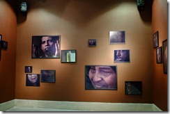
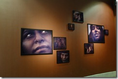
I didn’t get to see all of this exhibition when I visited for the Saturday events, so I will return and add my notes to these. The first part I did see was by Laura El-Tantawy. You walk into the room and it’s all matching tones of browns and earth colours. The walls, framing and colour of the images all complimented each other with the different tones. First to be noticed was the framing, the images were different sizes and all arranged differently into what seemed to be groups. I didn’t know if all the groups were reacting to the same trigger point and that’s why they were together or if I’m looking at the facial expressions and jumping to that conclusion myself. The images have a very close composition on the subjects, the faces are all cropped in some way, sometimes you don’t even see their eyes, they are hidden by hands. I did notice that hands and their position play a key part running through the images, there were biting of nails, covering eyes and even praying. All of the subjects look upset or emotional and it’s left to the viewer to interpret this, I saw hope in some eyes but grief in others.

Saturday 18th May Events

Tom Wood

Back in the performance space where the events of Friday were, the house was almost full for the Tom Wood talk. John Davies who spoke on the Thursday was also in the audience for the talk and actually began by giving the audience his thoughts on Wood. Whereas the comments on Thursday were very much that ‘the photographers soul is captured by the photographs you choose to capture’, Davies said of Wood that he is ‘capturing his own soul when he’s photographing’ with a reflection of his culture and where he’s from in the people that he’s photographing.

This was meant to be a joint book launch with his new work ‘Men and Women’ but at the time of the event the book wasn’t quite ready from the publishers. Hopefully he will return at some point and present the book. At the end of the talk a limited few copies of some of his previous books were for sale, while I didn’t hang around, I was halfway in the quite long queue with the majority selling out before I got to the front of the queue. I plan on getting his next book though when it’s available, some of the images were presented here as part of the talk and I’d like to see more of them.

The format of the talk was Wood speaking, a presentation of a number of images of his different work and projects over the years and people jumping in with questions. While Wood said that he got bored talking and preferred to have people ask questions to keep it interesting for himself, I was really gripped by the talk and listening to him, so for me the questions were interesting but the main draw was really to hear Wood speak.

The photographs were of different subjects and groups taken over his career including the Men and Women series, Looking for Love (Chelsea Reach Nightclub) and All zones off peak (bus travel around Merseyside)

Background

Wood used to go through magazines and postcards in charity shops and compile these into collages. He was always interested in other people’s images and how they can be used, so from an early age he was making decisions on pictures and how they go together. Currently he works with fine artist Padraig Timoney, looking at not the images he knows are good but the other ones to see what can be used in the compilation of books.

Wood moved to Merseyside in 1978 and used colour despite it being more expensive than black and white because he liked the colour. He didn’t know at the time that he was meant to use black and white (colour wasn’t seen as fashionable). His technique has been walking around asking people if he can take their photographs, some said yes, others would say come back. It was all about getting to know an area and the people within it, building a relationship of trust. The All zones off peak series grew from him using the bus network as a way to explore the New Brighton area. At this point John Davies contributed that the people in Wood’s images come across as extended family and also that “anything you want can be landscape” Looking at some of the images, the wider street shots where you have people in it, but they’re not the largest or strongest point of interest and you can see the street and the context that this is more than a portrait, and more than street photography. Landscape, as I am learning is a very generic term that can be tied down to be the beautiful rolling countryside but also the gritty urban cityscape. If I progress with landscape I need to focus very clearly on what it means to me, as opposed to the general view of what it means.

All zones off peak

With the bus travel he would keep repeating the bus routes, getting on at the start, then hopping off at the end, crossing over and getting back on. He sensed who didn’t want their pictures taken and who did. At first he tried to avoid the reflections but after years he realised that they added to the magic. He has photographic accidents, where he gets slow shutter speeds, changing light, blur and didn’t know what he was going to get.

Other work

For the Chelsea Reach series, he used either flash and took one shot, or he used infrared film and a filter on the flash so that he could prevent the people within the club from seeing the flash and allowing him to take more than one image, but he stopped used this as he felt that it was cheating.
Some of the subject he followed and photographed them a number of times, an example was Rachel, when she was 13, 17 and then 33. He printed copies of the portraits he took and shared them with the people he photographed, as well as building up a relationship, they were assured that he was who he was (there was a fear it could be someone investigating dole claims etc) and were more inclined to either be photographed again, or would pass word around to friends and family that he was ok, and then he’d get more compliance. Wood enjoys taking pictures and selecting them but isn’t keen on the editing, sending and all the other day to day tasks. Using a mixture of film cameras from Rolleicord’s to Leica’s he moved to digital around 18 months ago. Prints are more exacting and compared to digital you are more able to see things that you weren’t expecting so it’s better to print images and review them.

Summary

This was one of my highlights of the weekend, while I like Martin Parr, I find his images are too bright and saturated for me, Wood combines the street and people photography with punchy but still natural colours and that really appeals. The subjects are really interesting and the stand out for me is the one of the three women all in a row at the ‘women’s market’, the middle one is staring into a container fascinating, I wonder whether there’s anything in there!

Saturday 19th May- the afternoon

The afternoon session after a short lunchbreak (some of which spent queuing for a Tom Wood book!) was Photopulse hosted by Miniclick. The premise was 10 photographers with 10 minutes each to talk about the theme of the festival ‘Who do you think you are’ and to show their work to us. I was looking forwards to seeing Jim Mortram as part of this but unfortunately he was unable to make it, however this didn’t detract from the event and I went into this now knowing any of the photographers and keeping an open mind.

Tadgh Devlin “The 5th Province”

First up we had Tadgh Devlin, an Irish photographer who was looking at home, and different versions of home, how Ireland had changed and also how Ireland is portrayed in other people’s eyes. Emigration was discussed; Irish exiles memories change when they’ve left, and when you return you’re not the same person. Some of the images shown were of the ferry leaving Ireland and the subjects stood with their backs to the camera looking through bars on the rear of the ship out to sea. You don’t see their faces, and don’t know why they are on the ferry, whether leaving Ireland is a short term or long term change. The project prompted him to look at the depiction of stereotypes, tourist attractions that are Irish but attract a wider range of visitors and then to look at his own family and where he grew up.

Eva Vermandel

Vermandel says she was the ‘reluctant photographer’ who wanted to try and break through the perfect surface and see something different. She showed us some of her influences, a lot of painters have proved inspiring, as have photographers such as Julia Margaret Cameron and Wolfgang Tillmans. The series presented here was called ‘Splinter’.

She likes things that have a barrier and need to break through this to get to the core of the work. She also suggested that a viewer needs to review the whole body of work when you look at it.

Alma Hasar

Hasar presented a really interesting concept and a twist on self-portraitures. She experimented with hide and seek, using other people’s houses as props. She had lost her creativity after finishing universality and this was the project that got her creativity back. As well as hiding in houses and taking portraits of herself in position, she also videoed herself getting in and out of the poses, one was on top of a stove within a fireplace. This was extended to inviting other people to send in their own images and videos which can be seen on tensecondsproject.co.uk. Throughout the process she started experimenting and covering her face so that no-one know who she is.

The second part of the presentation was a work called ‘Cosmic Surgery’, again this featured photographic portraits taken but then added to. Hasar would take a print of the image and turn this into an origami shape. This shape would be laid out over another print and cover the face of the subject, then being rephotographed as the final version. Whereas the hide and seek images I really loved, even the video showing the people ‘disappearing’, the work within ‘Cosmic Surgery’ made me feel really uncomfortable. You struggle to see the person within the origami; the effect is very alien with a disfigured set of shapes with eyes, noses and mouths all in different positions on the face.

Jack Latham

Latham, a new graduate from a documentary photography course, presented a piece of work taken over two visits to the USA where he would retrace the steps of the pioneers along the Oregon Trail. At the time of the presentation he had taken the images over two visits and was planning a final one to complete the series. Using a large wooden camera he looked at areas around motels, looking at pit stops where you would stop and gather yourself before moving on. He wasn’t trying to document or make a statement about the people he met, they were just people he stumbled upon and got talking to, he would talk to the people he met for a while before introducing the photography as he doesn’t want to exploit them.

Chloe Dewe Matthews

The series presented by Dewe Matthews was an older piece of work called Banger Boys of Britain. This was a four year old project that she undertook when she was first getting to grips with photography. As the title suggests she was focusing on the sport of banger racing and the images showed the whole range from the pit area and getting ready through to the final smash up, with Dewe Matthews saying that for her, the action leading up to the race and final smash was more exciting. Photography in her view is about getting there and having a role within the system, everyone is playing a role. I really enjoyed this talk and actually mentioned to a friend that I was visiting with that she reminded me of Tom Wood. All the subjects are respectfully treated and that comes across, she’s gotten to know the subject and area and the repeated exposure shows in the images.

Break time

We had a halfway break at this point when I chose to go and nosy at the miniclick stand where I bought a copy of their March journal. Featuring some of the photographers in this event and some new ones, this was a really interesting introduction to some photographers new to me and showing some examples of their work. I was quite pleased as Laura Pannack, who I enjoyed listening to on the Thursday was featured.

After the break, we continued with the remaining 5 photographers, looking at my notes and thinking back, I think that I engaged more with these photographers and their work but I’ll certainly be looking out for all of them in the future.

Niall McDiarmid

I’ve put a large asterisk against my notes for Niall McDiarmid, and looking back I remember how engaged I was with his talk and work. I would have liked to have seen more but obviously everyone has their own timeslot. His project ‘Crossing Paths’ started in walks around London, and then he started stopping at commuter towns outside of London. His work is portraits, he looks for people as he’s out and about, taking a couple of shots of each person but not wanting anything that would distract. Looking at their clothing and the surrounding area and framing them in the right place so that the colours complement each other and don’t clash but considering colours, shapes and textures within the subject and the area. From here he extended to group shots looking at the dynamic between the people. The idea behind the work was that he would go for a walk and see who he could meet. Unfortunately due to the time constraint, he said that there were individual stories with each of the people but that he hadn’t time to go into these at this point- but I would love to know the back stories and how he felt as he spotted people that were photogenic. As he said photographing people is always a challenge as the dynamics don’t always work. At the moment he is still travelling about the country, working in different regions, looking at places that seem to have fallen off the photographic radar.

Jenny Wicks

Most of Wicks’ work looks at identity and the impact that environment can have on us. She showed the genetic lottery work, ‘Root Ginger: A study of red hair’ looking at the genes carried out which determine red hair. This project took on a life of its own and while she undertook it with a positive view, showing how stunning redheads can be, it also attracted a lot of press interest and negativity. Wicks felt that you can lose perspective hen working on a long project and feels this lots it integrity and that the press publicity created a negative impact on the actual project. I missed this project and all of the press interest, however I do know that the images in her slideshow were stunning and the little child with blue eyes and porcelain skin is breath taking in its colours and beauty. The second work Wicks showed was a piece on trying to re envision herself from being trapped between parenthood and photography.

Sophie Gerrard

Gerrard started off as an environmental scientist but changed roles after she realised she wanted to be the person showing the areas that needed looking after. After she moved back to Scotland, she noticed that her personal voice getting stronger, with work featuring people in their environments and how it affects them. She feels that she has the responsibility got representing these people and showing them as part of a context, her current project is ‘Drawn to the land’ featuring women farmers.

Ciara Leeming

Leeming’s ‘Roma Britain’ project is photographing Romanian and eastern European roma people that have moved over the UK. Her neighbourhood has a lot of Roma and wanted to get access to the community. One of the subjects that she is working with is a young Roma girl who is walking a tightrope between being a traditional Roma woman and the non-traditional more westernised person. What comes across is that Leeming really knows her audience, she’s sympathetic, no agenda and just showing an honest representation of this community and she is trying to challenge stereotypes and showing the tensions between family and community and tradition.

Maja Daniels

Daniels’ work features two identical twins Monette & Mady who call themselves the ‘diamond sisters’. Based in Paris, they used to be in cabaret together but now have Paris as their stage as they dress identically and adopt the same poses. While this is a positive and alternative attitude to aging, they have also created their own sideshow as they walk around and pose around the city

Summary

This was a really good event and more than worth seeing, it actually overran but could stretch to longer than a couple of hours anyway. Seeing snapshots of different work and projects is quite exciting as even if you don’t like some of it, there will be something else. I also found that even if I didn’t like the images, I enjoyed listening to the background and why they had taken these images or looked at a special subject. I don’t expect everyone to like all of my work it’s about knowing what it works and why the photographer has done it that way.

Open Eye Study Visit 20th April

Coming up to this study visit, I wasn’t sure whether it was worth going to or not. Let me qualify that statement, I’d seen Mishka Henner talk in depth about his work at the Leeds Student Weekend in September 2012, I’d also been to the curator talk when this exhibition opened and listened to Henner and Karen Newman (Curator) speak, so I wasn’t coming to this discussion with fresh eyes. However the chance to catch up with some fellow students and to see the Tudor-Hart exhibition was enough of a pull.

The visit was mixed between a few who had seen Henner in Leeds and others who were new to the exhibitions. Compared to previous study visits, this one seemed very flat in atmosphere and quite quiet, I’ve never known a visit where we were so quiet. It was noticed that a lot of people who visited didn’t spend long looking at the work and went upstairs to the archive exhibition. Again I feel that there wasn’t enough supporting text that this work needs as it’s not just visual, it’s the whole process of research, choice and selection. After we’d spent an hour or so looking at this, we broke for coffee and split into two groups led by Peter and Keith. The debate was much more dynamic, starting from what we thought about the work through to examining why we did or didn’t like something, and identifying components that give us that feeling, through to the age old debate of what is fine art photography! We could have continued there all day and for me, the sitting around with a coffee in a small group discussion is the highlight, only through discussion can I hope to evolve and grow my critical thinking.

The second part of the visit was the Edith Tudor-Hart archive exhibition, I hadn’t time to see this when I last visited so I was looking at this anew. First thoughts were that these were some strong images with a very good grasp of the elements that made a photograph work, from leading lines and strong patterns through to the use of light. On further inspection some stood out for me, I liked the way the light fell highlighting specific areas, how the people within the images were aware of and accepting of the camera yet not looking out of character. Compared to Henner this made me inspired, I wanted to look at more of her work and I’ll certainly go back and do some research.

I appreciate that we had two very different styles, one, direct photography, the other appropriation and re-seeing of things that already exist. I can see benefits and advantages of both, and I’m certainly not against either method, both have their place.

Mishka Henner- Precious Commodities

– Book collection was mixed, the content of some was confused and I didn’t see why it was relevant, it was almost taking appropriation too far e.g. ‘The global villa, logs and mark’s by Victor Sira, just seemed to be a random collection and I didn’t get the message they were trying to put across. On the other hand, I really loved ‘Lost Memories’ by Joachim Schmidt, a collection of wanted ads for lost cameras, made me wonder what had happened to the cameras and if anyone had actually seen the images on them.
– Not enough text to accompany the work

– Geological maps- wonder why they are there, it’s only when you read the free leaflet that its highlighted that he used these to identify locations for his larger Levelland Oilfield work.

P4201319

Looking at the Levelland Oilfield work

Highlights

– Levelland Oilfield was eye catching and as the largest piece the showstopper of the exhibition

– Discussion with fellow students always worthwhile

– Seeing “ Less Americains” makes sense now I’ve looked at the original work more

What I took away with me

– Changing well known work and removing parts of it spurred two reactions on, one to see the original, the second to modify the work and add bits in

– Came away with ideas on how I could appropriate the work myself

Notes

This was the third time of seeing the exhibition and I think it helped having been to the curator talk with Henner and Karen Newman. There does need to be some more supporting text with this as I feel that his though processes and the all the effort that goes into this that we don’t see, doesn’t come across as it should do

Edith Tudor-Hart ‘Quiet Radicalism’


image

North London c 1934

P4201331

Looking at the archive exhibition

Highlights

– Composition of the images

– The use of light in them to highlight specific areas

– Strong black and white tones which were aided by good compositions featuring a spread of light and dark tones across the image, e.g. in the colours that the people were wearing

What I took away with me

– Try to envisage the lighting better when seeing in black and white

– Always use strong composition

– Get the subject eye, they’ll respond differently (hopefully for the better)

Notes

– Really enjoyed these, lots for the eye to look at in the image. From the selection that was on offer, I didn’t feel that her propaganda or political side came through too strongly

Study visit 9th February 2013 at the Open Eye Gallery

‘A lecture upon a shadow’- Open Eye Gallery Liverpool

This was a well attended study visit, when I arrived the foyer was full of fellow students all mooching around the excellent but far too tempting Open Eye shop.

As this was a split study visit we spent some time looking at the images, some time discussing them in groups and then a break partway through for discussion and coffee before moving onto the second part of the visit. A lecture upon a shadow was a mixed exhibition between artists with three artists from the North West and three from Shanghai and this had already been exhibited in China. Based on the title of a John Donne poem, A lecture upon a shadow certainly gave us all plenty to think about. For me the work was too mixed and I struggled to see a connection between the UK and Chinese photographers as well as a running theme throughout. Its only now looking back and doing some more reading about this that I can see a link between some, loneliness is very key in the work by Fan Shi San, composite images looking at the one child policy within China and the effect this has on the ‘only child’ of each family. This sense of loneliness and sadness pours out of the images and while it affect people differently- as an only child who has always been content as just me, I didn’t feel moved by this, yet others did, but again it goes back to not only seeing what the photographer wants us to see and feel from an image, but also what we bring to it and also how we feel on that particular occasion. Referring back to the theme that I feel is evident in some of these, when thinking about the standout piece ‘Eldon Grove’ by Liverpool based photographer Tabitha Jussa, it goes from an abandoned housing estate but then gets you thinking about the area, the people who were there and the fact that it’s now fallen silent but traces of life are still there. Not all of the exhibits worked for me, David Penny’s ‘Dutch Paintings’ where the photographs sit behind yellow and blue coloured glass were visually striking but the impact wouldn’t have been there without the colour. Also the work that struck me with a strong visual impact and shape on the wall was ‘Corpus Mercatorium’ by David Jacques, it’s very interesting to look at but for me feels out of place with its mixture of photographs cut out and stuck to different shapes from books. The whole mixture was reminiscent of Victoriana and not only did it not fit into the rest of the exhibition, for me it left me cold (and I did feel it was a bit creepy)

Part one of the study visit

IMG_8277IMG_8278IMG_8279

David Penny ‘Dutch Paintings’

IMG_8281IMG_8282

Liang Yue ‘Numerous Continuation: Summer Autumn Chaos’

IMG_8283IMG_8284IMG_8285

Man Yi ‘Memory of Water’

IMG_8287

Looking at Fan Shi San’s ‘Two of Us’

IMG_8288

IMG_8289IMG_8290

Tabitha Jussa ‘Eldon Grove’

IMG_8292

David Jacques’ ‘Corpus Mercatorium’

IMG_8295

After we’d looked around this we then all decamped where the sheer number of us dictated some re-organisation and takeover of the coffee shop! We split into groups and had discussions on many topics not least what we had seen at the gallery, as usual we all had our own like and dislikes and our own take on what we had seen. These discussions are really worthwhile as while we might disagree there is always acceptance that someone else’s thoughts are just as valid as your own.

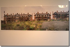
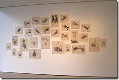
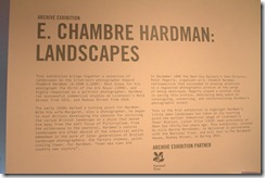
Archive exhibition- Landscapes by Edward Chambre- Hardman

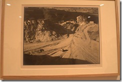
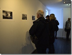
The second part of the visit was to see the archive exhibition by Edward Chambre-Hardman. I was looking forwards to this as I hadn’t seen any of his work and Keith was able to give us some background information on this as he is working on the archive at the moment and could bring an insight into the work and collection of the photographer. While Chambre-Hardman was more known for this commercial work and portraits, his personal work included landscapes. Amusingly when he sold his collection to the Liverpool record office, he neglected to include some work including his landscapes. I did like some of the images, his use of strong shapes in the images and very heavy clouds (obviously timing is a key component in a good landscape) that give some of the images a strong atmosphere really stood out for me. However I didn’t like the overly yellow tones of the images, which I don’t feel were helped by the warm cream border around them. I like landscapes but I personally prefer strong colours in mine so while these were excellent examples, they weren’t to my taste. The gallery was quite busy while we were there and members of public were coming in and out, one woman spent a lot of time looking at the images while Peter Haveland was giving us some thoughts on Chambre-Hardman, he said something that struck a chord with this visitor who took offence and declared that what he was saying was incorrect and that she knew Chambre-Hardman. Unfortunately she wasn’t willing to stay around to add to the debate and left us all quite amused.


IMG_8296IMG_8297IMG_8300

Examples of work by Edward Chambre-Hardman

ech postcards1ech postcards2

sv9th feb 001

Highlights of the visit

Meeting Keith Roberts- we’d spoke via email and phone during my last course

Catching up with some of the other students some that I hadn’t seen since the Leeds study weekend

Being introduced to new photographers- loved Tabitha Jussa- definitely my kind of work

Getting a different take on landscape from a photographer that I hadn’t previously been introduced to

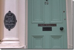
After the visit ended, I wandered around Liverpool looking for suitable buildings and locations to photograph for my next exercises and assignment. On the way back from Liverpool’s Anglican Cathedral, I just happened to pass Chambre-Hardmans house in Rodney Street which is now owned by the National trust. While it wasn’t open at the time, I’ll certainly make an effort to return and to have a look around

.IMG_8410IMG_8411

Jim Mortram ‘Small Town Inertia’ Study Visit

Pre-Exhibition and introduction

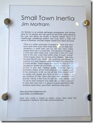
This was my second study visit to the Bank Street Arts centre, and was no easier to find this time around! The subject of this visit was an exhibition of prints by Jim Mortram “Small town inertia” which was curated by OCA tutor Andrew Conroy so we had both the benefit of a tutors experience with the background of putting this work on show. We began the visit with a coffee and a discussion, the usual pointers of what we should be looking at, some background on Andrew’s involvement and an overview of Jim and his work. Having already seen Jim’s work in the BJP and on the BBC webpage, I was looking forwards to seeing this in reality. Part of the pre-reading for this visit was to look at Julie’s story by Darcy Padilla and to read comments on the We are OCA pages to fuel a debate on documentary photography. Thoughts on Padilla’s work were varied as expected and there was very much a feeling of exploitation, while a relationship was developed between the photographer and Julie, it seemed to be a case that it was more one sided than the other. We were bearing this in mind as we all then headed upstairs to view the gallery.

The exhibition

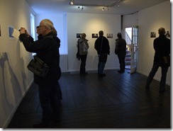
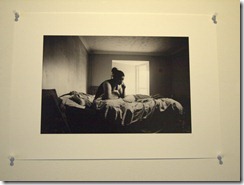
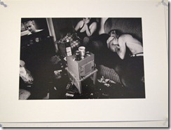
Refreshingly the prints were just mounted to the wall with white push pins, no framing or mounting and the simplicity of this certainly gave me hope that putting on an exhibition would be within reach at some point.

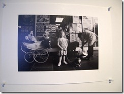
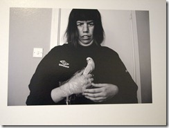
The plan was to look at the images and then to get together and discuss a few key prints that had been identified. All the images were monochrome, with the varied ranges of tone adding to the atmosphere with the subjects; it also added a feeling that you couldn’t always date the images. One image had an old silver cross style pram in it but when you looked further, you could see a shop advertising sim cards so putting it in more recent times. I certainly got the feeling from the subjects that they were comfortable with Jim being in their homes and taking photographs, and then later on this was explained further by our discussion with Jim where he explained his process of getting to know them, listening to their stories and then taking photographs when the time was right, not having a set agenda, if it didn’t happen there would be another day.

After we’d all looked around the images, we then discussed a number of images and how we felt about them. Some of us were struggling to feel anything about the series, there was a sense of detachment from the subjects within. I thought that in my case it was because I’d seen quite a few before in my pre visit study, but there was some discussion that it was more to do with the lack of captions (a considered curatorial choice) and information on the subjects. When reading the images, we were very much looking at the camera angles, the positioning of the subject, the surrounding location and possessions and making a view that was influenced by our own backgrounds. The choice behind no text or captions was very much designed to force us to make our minds up and to make the connection.

P2021288P2021290P2021292P2021293P2021296P2021299P2021300P2021301P2021302P2021303P2021304P2021306

Video and Discussion

We then went downstairs to watch some videos of the subjects. The first one was images set to music, the other two were photographs mixed with an audio of the subject talking. At this point I think we all suddenly clicked, seeing images and being able to relate them to a voice speaking about an accident where they went blind, or losing their partner because they couldn’t get an ambulance to come really hit home and when the videos finished there was just stunned silence. That would have been more useful before we saw the images as now we really did have the emotional connection. The highlight of the visit had to be when we were all huddled around an ipad having a skype conversation with Jim, this wasn’t without interruption on both sides as we were moved out of the room we were in, and Jim had his enthusiastic dog wanting to join in but that’s very much in keeping with his photography- fitting it in around his commitment as a full time carer, and for us students who often have to juggle work and family commitments with our studies, snatching opportunities where we can. Listening to Jim wasn’t like listening to a photographer, it was like a conversation with a friend or a fellow student, his passion and enthusiasm came through and having that insight into his work and the processes was illuminating. We got from this conversation information that you would never get as a part of a photography exhibition. Jim gets to know the subjects and builds a relationship with them, not planning the images but just taking them when he feels its right to, some days it’s just conversation and a chance for both him and the subject to have some contact with the outside world. Whereas some photographers have their subject and once they’ve got the image that’s it done, Jim keeps in touch with them. While we wondered whether some of the subjects had seen their images, especially with a debate over the less flattering of images, we discovered that no-one had ever complained. I admit I took pages of notes, not all of them are here, and some are just in my art journal as I don’t think I can do justice to the day.

The people

While Jim was passionate about his photography, what really came across was his enthusiasm and dedication to listen to peoples stories, to document his local community and to provide a positive voice to people who aren’t being heard. This isn’t a short term project, this is a lifetime of work, a collaboration of trust and community, taking and giving back. To hear and see these people brings them to life, I might never visit their town but I can know who they are through this work and it does provoke a desire to do the same in my local area. As Jim said “these are the stories that need to be seen”

Summary

– Conversation with Jim- being able to hear first hand his thoughts and processes around the images and how its an involved process giving a voice to the community

– Seeing images presented in a non framed way- much more immediate

– Catching up with other students

Henri Cartier- Bresson- A Question of colour. Somerset House, London 12th January 2013

Capture

I was looking forwards to this exhibition, I’ve never seen any of Cartier-Bresson’s work displayed and after looking at his ‘A propos de Paris’ book recently; I was interested in seeing some in person. Curated by William A Ewing, this features some images by Cartier-Bresson that had never been exhibited before, and the title ‘a question of colour’ was certainly apt, comparing the Cartier-Bresson’s well known black and white images with those in different shades of colour from similar tones, to zingy and vibrant. Capturing the decisive moment in these, the question is not now about whether it should be colour or black and white. It’s more about the subject, the composition and what that photographer is showing you. Looking onto a snapshot moment on the street in most cases, a strong subject will be that whatever colour it’s viewed in.

The fact this exhibition was a mixed set interested me and allowed me to get to know some new (to me) photographers that I like and some that I don’t. The outstanding photographer within these for me was Karl Baden; I liked his strong use of shapes and colour and how he made use of objects such as car windows to frame the subject.

clip_image002[8]

Some of the images taken by Joel Meyerowitz caught my eye, especially the woman in the Fifth Avenue, NYC image.


clip_image002

The closeness of the subject and the fact she is holding a book entitled ‘The American Character’ shows that he was in the right place at the right time to capture an interesting character; again going back to my earlier comments on the comfort level of the photographic in a well-known area comes through. For me the exhibit shows that colour can equal black and white and in some cases surpass it. Strong, vibrant colours make the images seem more real, black and white tones make the images seem more hard hitting and gritty in some cases. The choice is there and I don’ t think you can opt for one or the other as they both have their strengths and weaknesses yet when done well, possess and extraordinary power.

Colour highlight for me was the Ernst Haas image of the Frigidaire in Paris, France 1954. The blue tones of the shop compliment the colour of the cars and the white bonnet of the woman walking past just ties it in with the signage.

clip_image002[4]

The monochrome highlight was Cartier-Bresson’s ‘Fish Market- Foulton Street’, it’s very atmospheric and you feel like you are looking back into time and I have to think that if this was in colour, it would not have that same feel.

clip_image002[6]

Overall thoughts

– It’s the content of the image that matters more not the colour

– Colour can add a feeling to an image but it still needs a strong subject

– Worthwhile for seeing the comparison between Cartier-Bresson and the photographers that have followed him as well as a good introduction to the different works and photographers that you might not have come across

– Exhibition catalogue would have been good but looks to have sold out

Tim Walker. Storyteller- Somerset house, London 12th January 2013

While I was in London I’d earmarked a couple of other exhibitions that were free to get in and not too far away from the Tate. Originally at Somerset house for the Cartier-Bresson exhibition, we actually came to this one first after lunch and a break to refresh ourselves after the Tate. Unfortunately it was really busy in there so I wasn’t able to take as much time as I would have liked looking at the images, and secondly it was in a number of smaller rooms that weren’t helped by the large props placed around.

Walking in, my eyes were first drawn to the prop of a giant Spitfire plane at an angle as opposed to the image it featured in. I love the mix of fantasy and reality in photography and this seemed to follow on nicely from some of the Photoshop experimentation that I had undertaken as part of the exercises in the previous module, Digital Photographic Practice. The outstanding feature was that everything in Walker’s images was carefully considered and meant to be there, there wasn’t anything left to chance and the details really drew me in as a viewer. It’s something I’ve been thinking about a lot recently with other work, and am now trying to consider that everything in there should be there and to be aware of all the components of the frame not just the main subject. While some of the images were grotesque and others beautiful, because of the colours and detail, I still enjoyed looking at them and some were quite humorous such as the people mocking up traffic signs or flowers and lips overlaid onto a photograph.

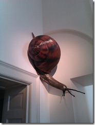
Again it was a shame that photography wasn’t allowed as it was a really well put together show and the little rooms and large props such as the giant swan carriage and giant snails helped to give a magical feel as you walked through. In contrast to the fantasy and the fashion images were a series of portraits that have to be my favourite so far. All of the portraits of these famous people had the same location, a white background and a white desk to sit at, the rest was the subject and any props they’d chosen/had chosen. The non cluttered background made the subject quite striking and really stand out and for sheer amusement; the series of the Monty Python cast with smoking bowler hats was striking, being clever, witty, amusing and technically perfect. Certainly something to aim towards in my portrait work. It did feel a little bit like a throwaway exhibition being in a gallery off the courtyard and through the smaller rooms but after viewing it, it certainly deserved the attention it was getting and I’d certainly recommend a visit to this and the Cartier- Bresson show.

Overall thoughts

– Wow

– Composite images can be as valid as a standard photograph

– Presentation can help the experience and to echo the contents of the collection or the subject matter

– Giant dolls are scary especially when filling a room but giant snails are fun

– Photography doesn’t have to be serious

– Consider everything little element in the frame


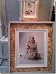
Giant snail prop                                         Some portraits

IMAG0306                    IMAG0304

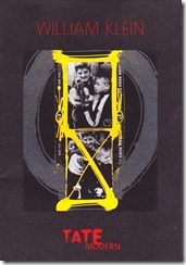
William Klein and Daido Moriyama. Tate Modern, London 12th January 2013

london 8london 6

I hadn’t been to London for around 7 years, and this was my first visit to the Tate Modern, finding it was relatively easy, it’s a huge imposing building on the side of the Thames next to the Globe theatre. Already impressed, I wasn’t expecting so much of the inner space to be vast and empty but this was just an indication on how huge an exhibition could be here. Collecting the tickets and gaining entry went smoothly, although it was frustrating not being able to take any photographs of the exhibitions or of the notes on each piece as I had to scribble the details down frantically and hoped that I’d managed to get most of it correct. As the exhibition was split between Klein and Moriyama, I’ll discuss them both separately and then summarise what I felt on the exhibition as a whole.

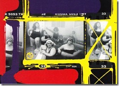
Stepping through the entrance into a dim room lit by a large video screen playing what I now know is’ Broadway by light’ was certainly overwhelming, on one side bright flashing video and soundtrack, the other had a wall stretching high above me with advertising images on them. It wasn’t what I was expecting from an entrance into a photography exhibition but it made more sense as I’d been through the different rooms. I felt that Klein was very mixed, and while I can appreciate his progression through the different methods, the way this was presented was jumbled, perhaps it was to show us that he has never really moved away from the ways of thinking and work in each area, coming back at a later data to add paint to contact sheets for example in ‘Club Allegro Fortissimo’.

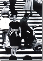
For me, I would have preferred a logical move through time so that I could see how he had grown and progressed but then I guess when do we actually work in isolation and keep it all neatly segregated. Unfortunately as the exhibition is close to finishing, I won’t be able to return to have another look which I am sure it would benefit from. The wide open spaces certainly benefited this exhibition with walls full of blown up almost floor to ceiling images, highlighting that some images such as ‘Evelyn, Isabella and Nena’ with the models echoing the tall skyscrapers in the background still have as much visual appeal as they did when first photographed with striking contrasts of the black and white. I liked the posed fashion shot, even though some of the models look quite severe, it got me thinking about planning and the set up that goes into what I’d refer to as a fashion portrait.

clip_image002

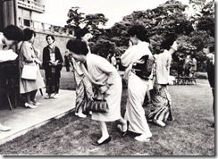
From these two iconic model images, we moved onto a huge wall of different portraits and then this flowed into more conventional hung images at eye height. His street photography covered different cities and some I found to be really interesting, and others such as the Tokyo 1961 series were a little disturbing. Without any clear narrative, when viewing a couple of the images such as the man on a bike grimacing and the man making what seemed to be wax heads, these seemed quite sinister and I was uncomfortable viewing these and it made me wonder whether Klein himself was at risk and how much acceptance did he have there? In direct contrast to that, the image of Tokyo night-time with its neon lights providing a fascination contrast between light and dark and then later in the exhibition I could see echoes of this in the painted wooden panels and the abstract patterns.

Street photography is one of those styles that I think a lot of students aim for but struggle to do and after viewing the New York images by Klein, I feel that he was stronger in these as he knows the area inside out compare to some of the other ones. They have a more coherent feel and while he cameras is right there in the middle of the situations, and the subject is often aware and looking at the camera, I feel there is more of a respect there than in the other image series such as Tokyo. Moving on from this, there was a video of excerpts from some of his films. I watched some of ‘Mr Freedom’ but didn’t really understand what it was about, the costumes and look of the film were eye catching but it just didn’t grab me. Following on, the final gallery of Klein’s looked at his contact sheets that he had revisited with enamel paint. After all the monochrome, the splash of colour on these was really eye catching with the organic painting providing a frame for the viewer to focus on. The only negative in this was that the impact of coloured paint on a coloured image of the funfair felt out of place and didn’t have the same power as the monochrome images.

A sample of Klein postcards

london 1london 2

london 5

Daido Moriyama

The next gallery was the start of the Daido Moriyama exhibition, in contrast to the Klein presentation, a lot of the images were presented as a smaller size and even in book form within cabinets, with an exception being the large work ‘Memory 2012’

Walking into this gallery, the first difference is the size of the images, they were smaller and on one wall all together like a collage and to see the details within these, and you had to stand close to study the image. As a comparison to Klein, the subject matter was much darker, and for some such as Provoke no 2 and Shibuya, this provoked thoughts and feelings of confusion as the images were blurred, confused as to why this image was taken and voyeuristic looking onto a moment that should be private not shared. It felt that Moriyama was showing two sides, one capturing a shadowy and hidden world where people are exposed in different ways and amounts, from the woman naked on the bed through to the aftermath of a car crash. The other of showing the mix of Japanese and western cultures merging, such as the stacked patterns of jars and boxes within a shop, later moving onto the larger images of commuters on a tube and an alternative portrait of a woman. Differing from this and really catching my eye were some of the abstracts such as Hysteric no 4, comprising of what seemed a large round fan in one images and spotted walls on another. It was hard to see what they were as objects but in monochrome the shapes and patterns were very striking and it was an interesting change.

One wall was taken up with Memory 2012, a large collage of a number of his works and I struggled to see how a number of what seemed random images fitted together into a coherent narrative. I stood there looking at them and I could group some into smaller themes but not one running through this. I bought one of his books and within this were some of the images and on their own with a couple of lines of narrative, they were much stronger compared to how they were displayed.

The Light and Shadow series of close ups of everyday images really stood out to me. While the rest of the exhibitions challenged me, this was much more comfortable as it’s similar to work I’d do. I found that because they were all monochrome that you focus on the shape and form of the subject, not what it or the overall image is. While for close up and everyday objects I tend to favour punchy colours, I’m going to try and experiment a little and see what they look like in black and white. The final outstanding piece for me was the room build built out of Polaroid’s, the idea to take hundreds of different colours, objects and rooms and then put them all together to project a room was very clever and there was so much to take in and look at within this installation. The exhibition closed on a video interview of Moriyama and some sample books before we exited through the gift shop.

Postcards and book by Moriyama


london 4DSC04122london 3london 7

Overall thoughts

– Too much to take in, too many rooms and images.

– Hard to see it all in one visit- would need to go back a couple of time

– Not always a clear narrative

– Felt I missed the input from other students and tutors which for a large and complex exhibition is really needed

– Personally I preferred Moriyama over Klein as I could identify with some of this work and the unusual subjects and compositions he showed.

Summary

Overall the exhibition was not about colour or black and white, but it was more light and dark, of the moods and content, different tones, how the content made us feel as viewers etc. I feel that both Klein and Moriyama were strong enough to hold their own exhibition in the whole of the space as opposed to sharing, and that the connection between the two wasn’t always that clear to the viewer. I’m pleased I managed to see it; not least it’s good to have the comparison of a large London show with what I’ve seen in my local area.


Richard Billingham talk- Manchester art gallery

Redeye had organised the event in conjunction with Manchester Art gallery’s late night Thursdays. The talk was from Richard Billingham who had some work exhibited in their current photographic exhibition: – ‘Focal Points: Art and Photography’. The talk was a sell out as we were all crammed into a square concrete room with industrial steel lighting and a large projector, although luckily once the lights went down, the focus was quite rightly on the screen. I’ve been to photography talks before and struggled at times with how stilted Billingham was, as a lecturer (and professor it was announced) I expected it to be a bit more like a lecture, but perhaps we were an audience outside of his comfort zone.

Starting with his early life, looking to study painting at university, we moved onto his work photographing his father Ray, initially to use as a reference for paintings, to moving more into photography, extending his subjects to his mum Liz, and younger brother. While this all sounds normal, in reality he was capturing the dysfunctional family of an alcoholic father, dominant mother, family splits and council housing. Photography moved onto film, still with the same subjects and at one point we saw a super 8 grainy video that he had slowed down of his father getting up from a chair and then falling back into it. As an outside viewing this, it was quite powerful to see and was voyeuristic as we saw this frustration and frailty of Ray. At no point were these works celebrations of his family, while his intimacy allowed him a freedom and access that would take years to build up, it’s as if these people were not related to him. While Billingham discussed the emotional attachment he has in many of his images, such as the series of the area where he grew up, I feel that there is a sense of disgust present not sympathy with these people. Personally I was interested in some of the detail, the camera’s he’d used, the thinking behind it- using the cheapest camera he could find as he wasn’t thinking in social documentary terms, looking at composition as if he was a painter. One image with a black headboard to the left, he felt needed balancing so put his thumb partly over the lens on the right hand side to balance this. It looks like a mistake if you’d viewed it as a straight image without the narrative.

Moving on from the ‘Rays a laugh’ and his home movies series, we went to landscapes both in his local area and across the UK, what kept coming across was that he had an emotional attachment to places and his subjects. His thinking process came across all the time as a painter first and photographer second although the key components are the same, light, composition, subject, balance etc. The final series was of zoos, as a keen animal and zoo photographer myself, I was interested on what these would look like as I strive to show that animals can look natural within their enclosure and these were almost the exact opposite., but he did state how do you make it look like it’s not in National Geographic. Featuring on the enclosure, the animals were almost an aside to their surroundings, and were often featured quite small within the frame. One feature that I found valuable was seeing how his work evolved in its displayed format from the basis degree show to work in galleries- differing depending on the subject and images. For the zoo series, these were displayed life-sized underneath glass as a replication to how you would view animals in enclosures.

We finished on a short video he had done based on ‘Bid TV’ type selling of a tiger painting. I thought it was more a spoof on the top 40 rundown but he saw it more as a countdown of the number of tigers left. This very much seemed the evening of an artist, not a painter, or photographer but of someone who uses different methods to express himself depending on what’s available and what results he gets.

Thoughts

The event was very interesting and certainly worthwhile the attendance, the venue itself was great- being able to walk about the galleries beforehand was really inspiring after a day at work and helped to get my mind prepared. I felt that there could have been more coherency between the images and the narrative from Billingham, whether it was technical or just a glitch, we seemed to jump around a little bit and there wasn’t always a clear thread from one to the other. It was great meeting up with other OCA students although I did miss a good debate afterwards as my train was in the opposite direction to the others.

What I got from the event

Presentation is very important- something that you learn and improve on over time. Need to consider narrative, editing, sequencing and mounting of the images. Consider the background walls- the colour may need changing to compliment the colours within the image

When you can’t find a way to take a photograph consider using a different type of media such as painting or video- it doesn’t matter how good it is, it’s how it does what you want and if it helps to move you to where you want to be

Composition- consider balance, form and imagery

Try to develop a relationship with the subject, and this might take time

Further research

3200 colour Konica film as this was a preference of his

Julian Jermaine

Michael Collins

Mamiya 7

Rays a laugh

Photojournalism Workshop at FACT

I stumbled across this photojournalism workshop by chance, I was looking at the FACT website when I saw a link on the page and discovered a free workshop. I’ve been on paid and free photography courses/workshops etc. before and always found a difference between the two, but today’s was as good as any paid course. The tutor and photographer Adam Lee was enthusiastic and knowledgeable and with a different mix of people in the room, we had some interesting thoughts and discussions. We looked at pathways to disseminate our images, social media, new websites and looked at Cam360 where I was the guinea pig who signed up for this. Outside of the workshop this is something that I will investigate and make use of.

The afternoon was broken into a number of parts, we paired up and looked through a selection of images from Reuters One World Now, picking what we thought was the strongest image and discussed why we felt it was a good image so the usual, colour, composition, story etc. Then we attempted to write a caption for another image we’d chosen, comparing these to ones in the book- obviously ours were much shorter and less descriptive than the correct one. We then had a chance to get out and about to take images, by this point it was after four so getting dark and the light rain turned much heavier while we were out. Not everyone had cameras but we managed to get some shots and once back inside the warmth of the studio, we worked in pairs again to write captions for chosen images, and whether it captured the photographers opinion and feelings of Liverpool.

Moving on from this we discussed tagging and tips on how to choose these effectively, then the last part of the day was on consent and permission. As usual with this topic there are some grey areas and some confusion. Interestly enough I’d used the cleaning cloth supplied by Amateur Photographer with photographers rights all over one side of it to dry off my soggy camera. This added to the debate of photography in a public and private place as the wording on there was approved by the home office.

Things I learnt

– Street photography in the UK and Liverpool is tricky before you even consider getting a consent form completed.

– If the photograph tells the story- don’t necessarily need to include a really long caption

– Captions are a mix of some of the visual things going on within the image and also describes the things that you can’t see

– Tags- take some of these from the caption

– Tags- consider the feelings that the image evokes, put these into tags

– Tags- put your name into tags so the images can be linked back to you

– Consent- don’t need adult consent if the image is not for profit

– Consent- consider getting video consent if an event where it’s not feasible to use paper forms