Tag Archives: study visit

Open Eye Study Visit 20th April

Coming up to this study visit, I wasn’t sure whether it was worth going to or not. Let me qualify that statement, I’d seen Mishka Henner talk in depth about his work at the Leeds Student Weekend in September 2012, I’d also been to the curator talk when this exhibition opened and listened to Henner and Karen Newman (Curator) speak, so I wasn’t coming to this discussion with fresh eyes. However the chance to catch up with some fellow students and to see the Tudor-Hart exhibition was enough of a pull.

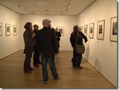
The visit was mixed between a few who had seen Henner in Leeds and others who were new to the exhibitions. Compared to previous study visits, this one seemed very flat in atmosphere and quite quiet, I’ve never known a visit where we were so quiet. It was noticed that a lot of people who visited didn’t spend long looking at the work and went upstairs to the archive exhibition. Again I feel that there wasn’t enough supporting text that this work needs as it’s not just visual, it’s the whole process of research, choice and selection. After we’d spent an hour or so looking at this, we broke for coffee and split into two groups led by Peter and Keith. The debate was much more dynamic, starting from what we thought about the work through to examining why we did or didn’t like something, and identifying components that give us that feeling, through to the age old debate of what is fine art photography! We could have continued there all day and for me, the sitting around with a coffee in a small group discussion is the highlight, only through discussion can I hope to evolve and grow my critical thinking.

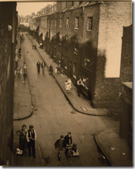
The second part of the visit was the Edith Tudor-Hart archive exhibition, I hadn’t time to see this when I last visited so I was looking at this anew. First thoughts were that these were some strong images with a very good grasp of the elements that made a photograph work, from leading lines and strong patterns through to the use of light. On further inspection some stood out for me, I liked the way the light fell highlighting specific areas, how the people within the images were aware of and accepting of the camera yet not looking out of character. Compared to Henner this made me inspired, I wanted to look at more of her work and I’ll certainly go back and do some research.

I appreciate that we had two very different styles, one, direct photography, the other appropriation and re-seeing of things that already exist. I can see benefits and advantages of both, and I’m certainly not against either method, both have their place.

Mishka Henner- Precious Commodities

– Book collection was mixed, the content of some was confused and I didn’t see why it was relevant, it was almost taking appropriation too far e.g. ‘The global villa, logs and mark’s by Victor Sira, just seemed to be a random collection and I didn’t get the message they were trying to put across. On the other hand, I really loved ‘Lost Memories’ by Joachim Schmidt, a collection of wanted ads for lost cameras, made me wonder what had happened to the cameras and if anyone had actually seen the images on them.

– Not enough text to accompany the work

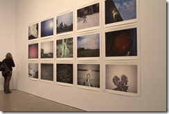
– Geological maps- wonder why they are there, it’s only when you read the free leaflet that its highlighted that he used these to identify locations for his larger Levelland Oilfield work.

P4201319

Looking at the Levelland Oilfield work

Highlights

– Levelland Oilfield was eye catching and as the largest piece the showstopper of the exhibition

– Discussion with fellow students always worthwhile

– Seeing “ Less Americains” makes sense now I’ve looked at the original work more

What I took away with me

– Changing well known work and removing parts of it spurred two reactions on, one to see the original, the second to modify the work and add bits in

– Came away with ideas on how I could appropriate the work myself

Notes

This was the third time of seeing the exhibition and I think it helped having been to the curator talk with Henner and Karen Newman. There does need to be some more supporting text with this as I feel that his though processes and the all the effort that goes into this that we don’t see, doesn’t come across as it should do

Edith Tudor-Hart ‘Quiet Radicalism’


image

North London c 1934

P4201331

Looking at the archive exhibition

Highlights

– Composition of the images

– The use of light in them to highlight specific areas

– Strong black and white tones which were aided by good compositions featuring a spread of light and dark tones across the image, e.g. in the colours that the people were wearing

What I took away with me

– Try to envisage the lighting better when seeing in black and white

– Always use strong composition

– Get the subject eye, they’ll respond differently (hopefully for the better)

Notes

– Really enjoyed these, lots for the eye to look at in the image. From the selection that was on offer, I didn’t feel that her propaganda or political side came through too strongly

Study visit 9th February 2013 at the Open Eye Gallery

‘A lecture upon a shadow’- Open Eye Gallery Liverpool

This was a well attended study visit, when I arrived the foyer was full of fellow students all mooching around the excellent but far too tempting Open Eye shop.

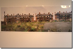
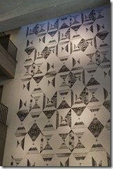
As this was a split study visit we spent some time looking at the images, some time discussing them in groups and then a break partway through for discussion and coffee before moving onto the second part of the visit. A lecture upon a shadow was a mixed exhibition between artists with three artists from the North West and three from Shanghai and this had already been exhibited in China. Based on the title of a John Donne poem, A lecture upon a shadow certainly gave us all plenty to think about. For me the work was too mixed and I struggled to see a connection between the UK and Chinese photographers as well as a running theme throughout. Its only now looking back and doing some more reading about this that I can see a link between some, loneliness is very key in the work by Fan Shi San, composite images looking at the one child policy within China and the effect this has on the ‘only child’ of each family. This sense of loneliness and sadness pours out of the images and while it affect people differently- as an only child who has always been content as just me, I didn’t feel moved by this, yet others did, but again it goes back to not only seeing what the photographer wants us to see and feel from an image, but also what we bring to it and also how we feel on that particular occasion. Referring back to the theme that I feel is evident in some of these, when thinking about the standout piece ‘Eldon Grove’ by Liverpool based photographer Tabitha Jussa, it goes from an abandoned housing estate but then gets you thinking about the area, the people who were there and the fact that it’s now fallen silent but traces of life are still there. Not all of the exhibits worked for me, David Penny’s ‘Dutch Paintings’ where the photographs sit behind yellow and blue coloured glass were visually striking but the impact wouldn’t have been there without the colour. Also the work that struck me with a strong visual impact and shape on the wall was ‘Corpus Mercatorium’ by David Jacques, it’s very interesting to look at but for me feels out of place with its mixture of photographs cut out and stuck to different shapes from books. The whole mixture was reminiscent of Victoriana and not only did it not fit into the rest of the exhibition, for me it left me cold (and I did feel it was a bit creepy)

Part one of the study visit

IMG_8277IMG_8278IMG_8279

David Penny ‘Dutch Paintings’

IMG_8281IMG_8282

Liang Yue ‘Numerous Continuation: Summer Autumn Chaos’

IMG_8283IMG_8284IMG_8285

Man Yi ‘Memory of Water’

IMG_8287

Looking at Fan Shi San’s ‘Two of Us’

IMG_8288

IMG_8289IMG_8290

Tabitha Jussa ‘Eldon Grove’

IMG_8292

David Jacques’ ‘Corpus Mercatorium’

IMG_8295

After we’d looked around this we then all decamped where the sheer number of us dictated some re-organisation and takeover of the coffee shop! We split into groups and had discussions on many topics not least what we had seen at the gallery, as usual we all had our own like and dislikes and our own take on what we had seen. These discussions are really worthwhile as while we might disagree there is always acceptance that someone else’s thoughts are just as valid as your own.

Archive exhibition- Landscapes by Edward Chambre- Hardman

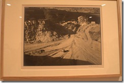
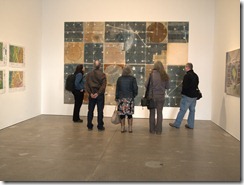
The second part of the visit was to see the archive exhibition by Edward Chambre-Hardman. I was looking forwards to this as I hadn’t seen any of his work and Keith was able to give us some background information on this as he is working on the archive at the moment and could bring an insight into the work and collection of the photographer. While Chambre-Hardman was more known for this commercial work and portraits, his personal work included landscapes. Amusingly when he sold his collection to the Liverpool record office, he neglected to include some work including his landscapes. I did like some of the images, his use of strong shapes in the images and very heavy clouds (obviously timing is a key component in a good landscape) that give some of the images a strong atmosphere really stood out for me. However I didn’t like the overly yellow tones of the images, which I don’t feel were helped by the warm cream border around them. I like landscapes but I personally prefer strong colours in mine so while these were excellent examples, they weren’t to my taste. The gallery was quite busy while we were there and members of public were coming in and out, one woman spent a lot of time looking at the images while Peter Haveland was giving us some thoughts on Chambre-Hardman, he said something that struck a chord with this visitor who took offence and declared that what he was saying was incorrect and that she knew Chambre-Hardman. Unfortunately she wasn’t willing to stay around to add to the debate and left us all quite amused.
 

IMG_8296IMG_8297IMG_8300

Examples of work by Edward Chambre-Hardman

ech postcards1ech postcards2

sv9th feb 001

Highlights of the visit

Meeting Keith Roberts- we’d spoke via email and phone during my last course

Catching up with some of the other students some that I hadn’t seen since the Leeds study weekend

Being introduced to new photographers- loved Tabitha Jussa- definitely my kind of work

Getting a different take on landscape from a photographer that I hadn’t previously been introduced to

After the visit ended, I wandered around Liverpool looking for suitable buildings and locations to photograph for my next exercises and assignment. On the way back from Liverpool’s Anglican Cathedral, I just happened to pass Chambre-Hardmans house in Rodney Street which is now owned by the National trust. While it wasn’t open at the time, I’ll certainly make an effort to return and to have a look around

.IMG_8410IMG_8411

Jim Mortram ‘Small Town Inertia’ Study Visit

Pre-Exhibition and introduction

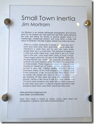
This was my second study visit to the Bank Street Arts centre, and was no easier to find this time around! The subject of this visit was an exhibition of prints by Jim Mortram “Small town inertia” which was curated by OCA tutor Andrew Conroy so we had both the benefit of a tutors experience with the background of putting this work on show. We began the visit with a coffee and a discussion, the usual pointers of what we should be looking at, some background on Andrew’s involvement and an overview of Jim and his work. Having already seen Jim’s work in the BJP and on the BBC webpage, I was looking forwards to seeing this in reality. Part of the pre-reading for this visit was to look at Julie’s story by Darcy Padilla and to read comments on the We are OCA pages to fuel a debate on documentary photography. Thoughts on Padilla’s work were varied as expected and there was very much a feeling of exploitation, while a relationship was developed between the photographer and Julie, it seemed to be a case that it was more one sided than the other. We were bearing this in mind as we all then headed upstairs to view the gallery.

The exhibition

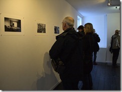
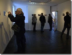
Refreshingly the prints were just mounted to the wall with white push pins, no framing or mounting and the simplicity of this certainly gave me hope that putting on an exhibition would be within reach at some point.

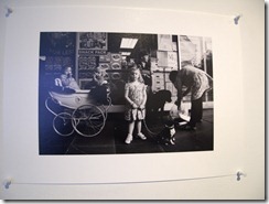
The plan was to look at the images and then to get together and discuss a few key prints that had been identified. All the images were monochrome, with the varied ranges of tone adding to the atmosphere with the subjects; it also added a feeling that you couldn’t always date the images. One image had an old silver cross style pram in it but when you looked further, you could see a shop advertising sim cards so putting it in more recent times. I certainly got the feeling from the subjects that they were comfortable with Jim being in their homes and taking photographs, and then later on this was explained further by our discussion with Jim where he explained his process of getting to know them, listening to their stories and then taking photographs when the time was right, not having a set agenda, if it didn’t happen there would be another day.
After we’d all looked around the images, we then discussed a number of images and how we felt about them. Some of us were struggling to feel anything about the series, there was a sense of detachment from the subjects within. I thought that in my case it was because I’d seen quite a few before in my pre visit study, but there was some discussion that it was more to do with the lack of captions (a considered curatorial choice) and information on the subjects. When reading the images, we were very much looking at the camera angles, the positioning of the subject, the surrounding location and possessions and making a view that was influenced by our own backgrounds. The choice behind no text or captions was very much designed to force us to make our minds up and to make the connection.

P2021288P2021290P2021292P2021293P2021296P2021299P2021300P2021301P2021302P2021303P2021304P2021306

Video and Discussion

We then went downstairs to watch some videos of the subjects. The first one was images set to music, the other two were photographs mixed with an audio of the subject talking. At this point I think we all suddenly clicked, seeing images and being able to relate them to a voice speaking about an accident where they went blind, or losing their partner because they couldn’t get an ambulance to come really hit home and when the videos finished there was just stunned silence. That would have been more useful before we saw the images as now we really did have the emotional connection. The highlight of the visit had to be when we were all huddled around an ipad having a skype conversation with Jim, this wasn’t without interruption on both sides as we were moved out of the room we were in, and Jim had his enthusiastic dog wanting to join in but that’s very much in keeping with his photography- fitting it in around his commitment as a full time carer, and for us students who often have to juggle work and family commitments with our studies, snatching opportunities where we can. Listening to Jim wasn’t like listening to a photographer, it was like a conversation with a friend or a fellow student, his passion and enthusiasm came through and having that insight into his work and the processes was illuminating. We got from this conversation information that you would never get as a part of a photography exhibition. Jim gets to know the subjects and builds a relationship with them, not planning the images but just taking them when he feels its right to, some days it’s just conversation and a chance for both him and the subject to have some contact with the outside world. Whereas some photographers have their subject and once they’ve got the image that’s it done, Jim keeps in touch with them. While we wondered whether some of the subjects had seen their images, especially with a debate over the less flattering of images, we discovered that no-one had ever complained. I admit I took pages of notes, not all of them are here, and some are just in my art journal as I don’t think I can do justice to the day.

The people

While Jim was passionate about his photography, what really came across was his enthusiasm and dedication to listen to peoples stories, to document his local community and to provide a positive voice to people who aren’t being heard. This isn’t a short term project, this is a lifetime of work, a collaboration of trust and community, taking and giving back. To hear and see these people brings them to life, I might never visit their town but I can know who they are through this work and it does provoke a desire to do the same in my local area. As Jim said “these are the stories that need to be seen”

Summary

– Conversation with Jim- being able to hear first hand his thoughts and processes around the images and how its an involved process giving a voice to the community

– Seeing images presented in a non framed way- much more immediate

– Catching up with other students

Liverpool Biennial Study visit ‘The Unexpected Guest’

I didn’t write my review up straight after the event as I felt like I had seen so much and I needed some time to process it. A couple of days and one draft later I’m still thinking and trying to make sense of it. While I enjoy seeing a lot of different exhibits in one day as it really forces you to compare and consider, what we see is not always straight forwards and while I can make a snap decision on whether I like it or not, I try to consider and reflect on what I’ve seen to the extent that whether I like it or not is largely irrelevant as I’m not looking to own the art but to understand what its saying to the viewer and to me.

We started off the visit at the Bluecoat Arts centre with some confusion and a coffee. I have to add the confusion was due to another event starting at the same time and not being obvious so for a short whole we had two new members of the OCA until they realised we weren’t their group! Over a coffee tutor Peter Haveland ran through the plan of the day, where we’d visit and some pointers on what we needed to be thinking about.

As the theme of the biennial is hospitality and entitled ‘The Unexpected Guest’ we were encouraged to think about whether the art met the brief, did it meet it fully or was it a tenuous link, were pieces created for this specifically or was it older work that fitted the theme?

With lots to think about we moved onto the first exhibition by John Akomfrah, ‘Delta Elegies’ was four large scale prints in one room but with two images per print divided by a black border to enhance the contrast between the content. While I couldn’t dispute the quality of the images at first it was hard to see where this fitted into the theme of hospitality. The information provided was minimal so we were all trying to understand what we were seeing. My guess was that these were people who had made a choice to pursue a different life, in these cases working with aircraft and engineering and were no longer seen as part of the community and were not spoken about or to. I struggled to know if these were old images or if there were modern staged prints as they had a very retro but modern feel about them. After viewing these we then moved through into ‘The Unfinished Conversation’ a film featuring academic Stuart Hall’s memories and archives as it starts with his life in Jamaica and his move to study and live in the UK and looking at identity, culture and class. The film was very well done with a mix of old film, new film, coloured blank screen and different audio tracks, constantly stimulating your senses as we not only see extracts from Hall’s life but those of the times around him as the film progresses through the decades. At one point the visual images start to speed up then flash by at a speed where it’s hard to keep up while the audio continued as it was. Bombarded we try to make sense of what identity is, how it changes and preconceptions of identity from the background we all originate from. A few minutes after this the system broke so we took a break to look at other work and then came back for the end. I felt that the break made the ending of the film much more intense as I’d had time to think about what I’d seen and to link this theme of finding your identity and dealing with other people’s views of you and how that can change when you look to increase your knowledge or move on in life with the images we’d seen before entering the video room.

Breaking up our viewing of ‘Unfinished Conversation’ were two different exhibits, the first one ‘Outside!’ by Dora Garcia was identified as a live talk show format, with four TVs showing different conversations, with three of them silent unless you put on the headphones. The extract that I heard was about the Toxteth riots and I while I can see how that links into the secondary theme of identity which seems to be running through the work in the Bluecoat, but I find it hard to see the connection with hospitality and uninvited guests without listening to more of it. The final exhibit was by Sun Xun and comprised a mixed media of wall painting, silk paintings and animation of Chinese traditional painting scrolls. We did have a debate about whether this was to do with the uninvited guest but felt it was more about tradition and we found it hard to link this simply because were all from different backgrounds with minimal knowledge of traditional Chinese culture. However when looking at Liverpool and its China Town area on the edge of the city, and street names in both Chinese and English, you have to think that at some point they were unexpected guests and having their own area hints at a past where we were less integrated than we seem to be now. However you can take this a step further and think about the hospitality visitors receive when visiting China Town. After the ending of the ‘Unfinished Conversation’, we all seemed a little overwhelmed so we moved onto the next venue.

wallpaper bluecoat

Above: Poster exhibition in the Blue Coat

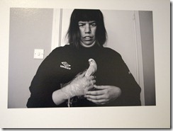
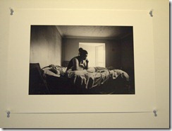
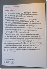
While it was only a short walk to Fact, we had an unplanned detour to ‘The Tea Factory’ also in Wood Street. Compared to the mixed media from the Bluecoat this was all photography by Sabelo Mlangeni with ‘My Storie’ and ‘Men only’. Reading the introduction, these were beginning with the idea of hospitality. All the images were monochrome and I felt that they were much older than they were; it was only when we started to notice modern features such as a mobile phone that it became clear this was more recent, with the series being from 2008 and 2012. The subject matter covered affluence, from what seemed to be poverty with the odd luxury to those who looked to be comfortable in the town of Stevenson. Thinking about this in hindsight, was I thinking of the unexpected guest in terms of pure physical presence when the unexpected guest could be anything we didn’t want, in this case is poverty the unexpected guest?

 flyer for sabelosabelo

Above: The Mlangeni exhibition.

Our third visit of the day was Fact where we managed a short lunch break to clear our minds and to chat about our courses, cameras and other matters. At Fact we saw four exhibits by Akram Zaatari, all of them in low or no light which made taking notes tricky and certainly made me nervous about what we were walking into. The first one ‘Another Resolution’ was a selection of photographs of children in poses which the artist thought showed seductive attitude’s and the result if adults replicated these poses, going from innocent through to odd with some of the semi-nude images. ‘Bodybuilders ‘ reprinted images from damaged negatives taken in the 1940’s and ‘Her and Him’ photographs and a film on an Egyptian woman undressing both seemed to be far away from the subject theme and this was one area where even after consideration I can’t fit into hospitality. I soon moved onto the next darkened room where there was four large screens forming a cube shape and we essentially became part of the work as you could only view it from within and it felt awkward as we all shuffled and moved about as the video went from one to the other, showing musicians playing and singing. In this exhibit also by Zaatari, we were the unexpected guest. In the last piece of work we saw, once again it was a video in a darkened room by Anja Kirschner and David Panos, from the content I presume that it was more about identity as it showed cavemen, archaeological excavation and then a modern kitchen in use so I thought it was this is where we’ve come from but some aspects weren’t clear and the only moment that I felt was about ‘The Uninvited Guest’ was when we saw a bottle of milk dropped as if the resident was surprised, but without seeing them fully, we can’t use facial expressions to gauge this.

window fact

Above: View from Fact cafe window

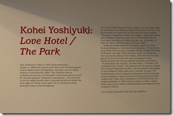
The last part of the study visit was a trip back to the Open Eye gallery where we’d been previously and I’ve always liked their exhibitions. The first thing I saw was Kohei Yoshiyuki’s ‘Love Hotel’ which was an indicator of what was to come. His ‘The Park’ set from 1971-79 was again in a darkened room, and on entering we were all given torches to illuminate the prints within. While the subject matter was serious and uncomfortable at times and we were made to feel like voyeurs watching on these couples having sexual encounters in the park, the actual experience of running the torch around the images and discovering the different components such as the number of voyeurs hiding in the bushes for example, was surprisingly good fun, and it was easy to see where the theme and these images fitted. Reading that photographer Mark Morrisoe was part of the punk scene didn’t come as a surprise as I entered this exhibition, the usually white walls had been painted vivid primary colours which helped the black framed images stand out. Again I’m not sure where this fitted within the theme of the biennial but it did fit well with Yoshiyuki’s work of voyeurism and sex.

openeyetwoopeneye

Above: Open Eye gallery

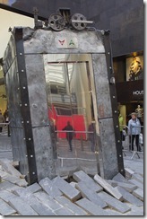
Some of us rounded up the study visit with another coffee discussing what we’d seen, what we liked and while I’m learning to read ‘visually’, I have to admit that from the selection I saw today that there are some tenuous links between the subjects and that it seems the work in each gallery can link, it doesn’t always and looking at 4 different sites, the theme is not strong enough to link them all. I do want to return and see some more of the exhibits and get a wider feel for this. My highlight of the day was the installation that I just stumbled upon, ‘The Lift’ by Oded Hirsch features an elevator that has crashed from the sky into the pavement of the Liverpool One shopping centre and looks entirely convincing as an unexpected event.

l1 The Lift

What did I learn?

That if I am using a theme for my images that it needs to be consistent and fit, not be a tenuous link

That I can admit that I don’t understand some work and despite trying not be able to ‘read’ everything

All exhibitions and art is beneficial as it helps to expands my thinking and can inspire ideas

That not all exhibitions in the dark are good ones and only to replicate this if I have a very good idea (ie torches!)

Questions to consider

Does the art/work I’m seeing fit the brief?

How much does it fit the brief?

Why did the artist think that this was worth exhibiting and viewing? Can we see why?

Was the artwork created before the event and just happens to fit, did it start the idea for the exhibition or was it commissioned specially for the event

How does the different works fit together with each other under one theme?

Study Visit- Sheffield. OCA v Sheffield Hallam

This was my first study visit to the Bank Street Arts centre in Sheffield and I was really looking forwards to seeing the collaboration between the OCA and the art centre in the form of the new exhibit by level 3 OCA student Tanya Ahmed with ‘I call this place home’

As a level one student with a long journey ahead of me with the my photography work, getting the chance to see work by other OCA students can be so beneficial to know where my peers are and to provide some assurance not of my creativity but that I’m on the right lines with the coursework I’m producing. Getting the chance to see level 3 work in person and to see where I need to evolve to was worth the travel over as we rarely get a chance to see this.

The gallery itself was very bright, light and airy with some natural light, however the spotlights did create some glare onto the glass of the images but that seems to be a common occurrence in galleries and as a viewer you just need to adjust your viewing point. However as a photographer, I need to give consideration to positioning in exhibitions, the lighting, the type of framing method I use etc. in an attempt to mitigate this issue and to present the work in the best form that I can.

We met as a group downstairs and had some discussion on the gallery and the collection. The images we were seeing were only a small amount from a much bigger piece of work and to be honest a couple of the images didn’t quite flow with the rest and I wonder if the ones that weren’t chosen would have been better placed here. With all of the views into the subjects homes, the men on the street and the guard on the street corner seemed to be at odds with these and feel like they belonged to a different collection. However the risk of having such a small selection of images from a larger body of work is choosing the right ones to effectively show the breadth of work and also to allow the images in a smaller selection to sit together and still work.

The images were taken around the East 100th street district where photographer Bruce Davidson had originally produced a body of work in the 1970’s and his book was placed in the gallery as a reference point. The discussion later on touched on the comparison and the differences between the two captured within the same geographical area, and how the viewpoints of the two artists differ over the span of time between the two. An overall thought was that Tanya was trying to get positive side over, the changes in the neighbourhood since Davidson’s work and the pride these people have. Her images show that there is a good relationship between Tanya and her subjects, these people being photographed have welcomed her into their homes and look relaxed with her presence. I questioned whether she had posed them specifically or if they’d just chosen themselves, however one of the other members of the group had attended the private view and was able to fill us in on the fact that Tanya had asked them to be where they were comfortable, she didn’t pose them. However she had requested that they didn’t undertake any tidying up, wanting the natural view but it seems mostly ignored by the subjects, but I’m sure that’s just basic human nature when expecting a visitor or a viewer to their house.

While most of the images of the inside of the apartments flow well, and if I hadn’t been told this was an area in New York, I wouldn’t have guessed, there was one image where we feel like a voyeur watching the subjects through an open door in their kitchen, looking very natural and not posed. While she’d been welcomed in to participate, this feels as if she in an outsider, and I wonder at which point in the process that this image was taken and it bring to mind a quote I’d read by Bruce Davidson where he said in reference to his work ‘Outside Inside’, “I start off as an outsider, usually photographing other outsiders, then, at some point, I step over a line and become an insider. I don’t do detached observation."

Without any text accompanying the images, aside from an introduction, as a viewer it’s more difficult to understand and interpret what we’re seeing.

sv1

Another debate that we had was on the actual physicality of the work, while there was no argument that the images showed good exposure and technical control, they were let down by the framing. While the print sizes varied, no attempt was made to ensure that all the frames were the same size and this meant that there was no fluidity between the frames as the eye had to move up and down to match the hanging. While an attempt had been made to level the tops, the differing sizes were obviously still there and we discussed some points for choosing and hanging prints which I’ll certainly list in my journal to refer back to.


Sheffield Hallam Degree Show

degree show

After the study visit we then walked over to Sheffield Hallam university to see ‘Creative Spark’ the BA Photography degree show. Seeing a degree show was a new experience for me so I was very interested to see what the quality of work of full time students undertaking a traditional degree would be like compared to the work I’ve seen by OCA students. First of I wasn’t expecting the high number of students to be exhibited, and secondly I wasn’t expecting the quality to be so mixed. Some specifics I was looking for more than the actual subjects of the work, was how it was presented and getting ideas for how I can present my work better when it comes to assessment. As well as the quality of work varying, so too did the presentation methods with hardbound books, soft booklet type books, large prints in archive boxes, postcards, projection and prints set together with physical props.

When looking at the content of the work, I was disappointed by the quality and as well as seeing technical flaws such portraits blown up that lacked sharpness, I was also concerned by some of the subject matter. One student had present a set of prints of animals in zoo’s and having used animals in zoos for previous work I’d submitted to the OCA, I struggled to understand why they’d first of all chosen the images they did, I felt the composition was nothing greater than a quick snap from a distance, and why she’d actually including the wires of the cage when with a good lens this can be eliminated to give a more natural image. I found that the selection entered here were images that I would have deleted on first review. I was also concerned by the British images of the tea set and of Chatsworth house, both subjects I’ve tackled before and with technical issues of missed focus and overall softness, lack of colour tones etc. I understand that it’s getting harder to come up with original ideas and takes on subjects, but if this is the quality after three years of teaching and study, I have to wonder as to the level of skill of some of the students concerned.

It wasn’t all negativity as I saw some work there that was both reminiscent of my own with the ‘Everyday Colours’ artwork by Elizabeth Colquitt. Some of the colour images I’ve taken previously would have fitted into this quite easily.

I did find it very beneficial to see different work and especially to review it with fellow OCA students and would consider seeing more degree shows next year.

Some gallery images:

sv2sv3SV5

Alice in Wonderland and Matisse study visit

Study visit 21st January 2012

Tate Liverpool- Alice in Wonderland
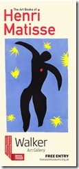
The Walker Art Gallery- The art books of Matisse

I was eagerly awaiting the Alice in Wonderland exhibition at the Tate Gallery in Liverpool, so as my second study visit, I was much more prepared and a lot less nervous as we met in the foyer. The exhibition was split over two floors, the ground floor offered a modern take using the underlying theme of ‘Wonderland’ which in some instances just made you wonder what the link with Carroll and the story actually was. Some pieces such as the bright neon lit tubes that formed words hanging over our heads, ‘Tate touché from my madinah: In pursuit of my ermitage’ by Jason Rhoades, was a stunningly visual and eye-catching installation. However it seemed a very tenuous connection to Carroll and could have stood its ground in another exhibition. Highlights for me from the ground floor were the 3 images by Annelies Strba. Her dreamy photographs/manipulations of an Alice like figure floating, feels more in keeping with what we have come to expect from the more traditional view. With the pieces on show here Nyima 438, less layered than the other images, Nyima 405 which seems to be very heavily layered with a composition that seems composed of a chess board black and white floor, a green leafy forest and the Alice character. The other image on display Nyima 445 has very vivid colours that capture the eye with the contrast between the red dress and the purple and green background, and I found the technique used in all the images of having the different layers all blended added a different quality to the art that could be interpreted as dreamlike.

The second part of the exhibition was in a gallery a few floors up, walking up the stairs I didn’t know what to expect on my own journey into the rabbit hole, and on entering the gallery I found it in stark contrast to downstairs, but also to some of the later exhibits. The open white space had gone to be replaced by heavy, dark colours, red walls and velvet drapes creating little rooms with the subdued lighting adding to the Victorian parlour feel. With the exhibition going through a number of rooms and almost winding paths, the flow is confusing and I have to wonder how much of this is a considered effect, and how much is like this due to the layout of the venue. I’d been aware of Carroll’s photographs previously after reading a book by Anne Higonet, but there were certainly some elements in this that surprised me, the connection to the pre Raphaelite brotherhood with work by Rossetti , Holman Hunt, and Hughes was one of these, and even more so the link to surrealism. As a fan of Dali and pre-Raphaelite art, I never expected that I’d see examples of these in the same exhibition and it shows that Carroll had such a wide reaching influence with the themes in Wonderland that future generations have taken the seed and planted it to become something very different but also traceable back to the origins.

As I went through the gallery into the more contemporary artworks, I found that the inspiration from Alice in Wonderland became quite tenuous, in a lot of cases it wasn’t obvious that it was inspired by it, and they could have stood alone outside of this exhibition. One of the stand outs of this section was the work by Anna Gaskell and her prints of a modern day Alice, not only were they large, bright coloured acrylic images, but they had a stand out obvious similarity to Alice that was missing in some of its contemporaries.

All in all, I really enjoyed this exhibition, while it wasn’t without its flaws, there was too much to look through and some parts didn’t flow as well as it could have done, I’d personally like to have seen less to allow me to focus on the areas that I really enjoyed.


alice4


alice1

alice6


alice2alice3

alice5


Part two of the study day was the art books of Matisse, and I went into this with a totally open mind as I hadn’t previously seen much of his work until I started researching him via the links that were sent over prior to the visit. The first part of the exhibition, I found to be quite understated, drawings to accompany poetry, such as that of Stephanie Mallarme, were either black on white, or white on black, a mixture of strong lines and sweeping lines, some very simple but I found them all very striking and powerful.

The second part of the exhibition was a vivid contrast of colours with these art books such as the famous ‘Jazz’ being on show. Looking at this from my photography perspective, the features that stood out to me were the primary colours, red, blue, yellow, very strong and eye-catching colours. Matisse has a way with strong lines and shapes that are a mixture of curves and jagged edges that managed to convey a sense of energy and movement. Despite the age the books were painted in, 1940’s to 1950’s they seem incredibly modern. Icarus stands out as it is so simple in its form, blue background, bright yellow stars dotted around the outside of the image and a black abstract figure broken up by a small splash of bright red on the chest.

My favourite overall image was ‘Le cheval, l’ecuyere, et le clown’ (The horse, the rider and the clown) from Jazz. The leading lines, strong horse shape and the contrast border really grab my attention. There is plenty of detail in the art, and I find it’s something that I can come back to again and again and not get bored of looking at it.

matisse 001matisse2

OCA Study visit- Open Eye Gallery Liverpool

I went on my first study visit with OCA on the 15th December 2011 at the new Open Eye gallery at Mann Island in Liverpool. The exhibitions I saw were ‘American Power’ by Mitch Epstein, and ‘The Pleasure Principle’ by Chris Steele-Perkins.

This was my first study visit so when the details came through and it suggested some prior reading and listening, I was keen to be as prepared as possible. As I hadn’t has any experience of either photographer I was interested in knowing more to me to get the best of the visit.

study visit 001

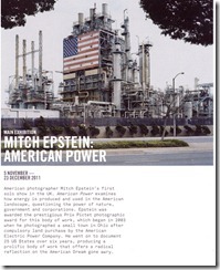
Mitch Epstein- American Power

When I looked at the American Power website, it encourages the viewer to look at their daily relationship with energy or ‘power’. With the purpose of heightening the awareness of the toll of using and producing the vast quantities of energy needed to keep modern society going.

The images in the exhibition were:-

– POCA high school and Amos Coal Powerplant

– BP Carson refinery

– Hoover Dam and Lake Mead

– Las Vegas

– Martha Murphy and Charlie Biggs

– Century Wind Project

– IOWA 80 truckstop

– Biloxi

The large format of the images and the smaller than usual number of images in the exhibition really added to the subject. I felt that the viewer took longer to look at and appreciate the images. For the POCA high school image, I felt that I needed to stand back from the image to take it all in. My eyes at first were drawn to the red of the American footballers tops, its only then that you notice the power plant in the background towering over the town.

As a contrast, the BP Carson refinery has so much detail in it, that as well as looking at it from afar, you also need to go closer to look at the detail. The trees at the top corners act as a frame, and the contrast of nature v man made can be drawn. The US flag really grabs my eye and reminds me that oil is such a big part of American life and history, Only when you step back from the image can you get a sense of the scale, and that’s where the large format of the prints adds a scale that isn’t available when viewing images over the modern techniques such as websites, slideshows etc.

Las Vegas

I found the contrast between the fantasy side of the holiday resorts, the pyramid and the castle, compared with the left of the image where it was all flat car parks with a huge number of cars showing the level of support needed for the entertainment and leisure industry that is so predominant within the city. In the background there is ‘Trump’ tower standing head and shoulders over the city, and further back the desert and hills that have not yet been taken over by commercialisation.

Century Wind Project

This is a contrast between two differing sides, the town and on the edge, a wind farm. It focuses, I think, on how nature can be harnessed to provide energy.

IOWA 80 truckstop

In contrast to the other images, this focuses on what springs up from the power industry, with businesses around the haulage firms providing a living for families, opposite to the view that power/energy is a destructive and negative entity at times.

Martha Murphy and Charlie Briggs

I couldn’t make sense of what I was seeing in this image, it provoked more questions than answers at the time. What had happened, what was the relationship here, what did the objects and symbolism mean, if anything? It also didn’t seem to fit in with the rest of the series. However when I got back home, I went onto the American Power website again and looked once more at the image and the back story. It wasn’t;t what I imagined, they weren’t a couple, they were employer and employee looking at the aftermath of Hurricane Katrina. The American power here is about the natural elements and the sheer power of human spirit.

Biloxi

This image was one I’ve seen on the publicity for the series of the images, and when I was first viewing it on a PC screen, I couldn’t grasp what I was looking at. Only when I stood in front of the huge image, did I realise that I was looking at upturned cars, mattresses and bedding pinned onto the trees after the devastation of Hurricane Katrina. Its the large scale that added so much to the content, allowing you as the viewer to get a better perspective and the small number of images encourages the viewer to take their time to take all the detail in.

Study visit mitch epstein

______________________________________________________________

Chris Steele- Perkins- The Pleasure Principle

study visit 002

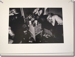
I found this to be quite a contrast compared to the Mitch Epstein exhibition. It didn’t have the same impact. I found that there didn’t seem to be any obvious correlation between the subjects, it doesn’t flow as a series. It could also have benefited from being more selective in the number of images it included. Also the images were quite small,so for some of them such as the cricket match needed to be viewed on a larger scale.

The title of the series was ‘The Pleasure Principle’, yet to me while it had some images of the 1980’s balls and parties, that could be under ‘pleasure’ it didn’t seem an accurate title, it seemed to me that some fell under excess and with this the images of the elephant and cricketers didn’t seem to fit in.

Images on display were:-

– Prime minister Margaret Thatcher’s admirers at the Conservative party conference

– Blackpool beach

– Golden mile, Blackpool

– Prince Edward at Berkeley Square ball

– Juliana’s summer party x 2

– Hypnosis demonstration at Cambridge university ball

– Berkeley Square ball

– Nightclub London x2

– British Movement demo, London

– Ballroom dancing, Blackpool

– Territorial army practice repelling a Soviet invasion

– Circus elephant, Crystal Palace

– Photo opportunity during a territorial army exercise

– Cricket match, Hampshire

Positives

– The photographer has managed to become invisible and get the images with the subjects not being aware, and continuing as if they were alone

Negatives

– Choice of images, not enough similarity between them to be a linked series

Summary

I really enjoyed my first study visit, I got a lot of benefit from sharing the experience with other students and discussing and debating, the contrast and message of the images. For a good few hours, this was well worthwhile and its good to meet fellow students, so I’d definitely go on more future visits and I’ll certainly keep an eye on events at the Open Eye gallery.

The Open Eye Gallery

Parts of the gallery are excellent for display, high ceilings, spotlights, and clean neutral colours, however some of the space has bright natural light that reflects on the glass framed images so you need to move about the gallery for the best positioning.

Study visit chris steele perkins